Top Therapist Websites: 21 Examples for Design Inspiration
Need design inspiration for your therapist website? 🌟
Whether you’re creating a brand new website for your therapy practice or just want to polish your current one, chances are you’re going to need some inspiration.
In this post, I've gathered 21 top therapist websites 🌟 We have all kinds of styles in the selection:
calm and approachable
feminine and gentle
playful and energetic
bold and vibrant etc.
They give a different vibe but they all have one thing in common: they look amazing and we’re going to reverse engineer why. 🤓 And maybe along the way you’ll gather some ideas for your own website. So keep reading 💖
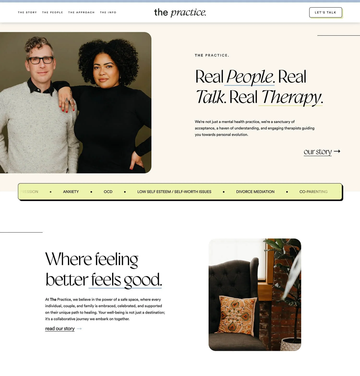
01 // The Practice
Made with: Squarespace
Starting with ‘The Practice’. Their website is fresh and modern with feel-good feeling and a hint of playfulness. Built with my go-to builder Squarespace. Great for DIY and, in this case, a professionally made website.
Things I loved ❤️:
The fun and sleek color palette. Definitely didn’t expect the pale lime green/mindaro pop into the colors. Nice little edge. 👌
The custom icons that represent the different modalities they use in their practice.
The 3D effect on the buttons. Makes them more visible and fun.
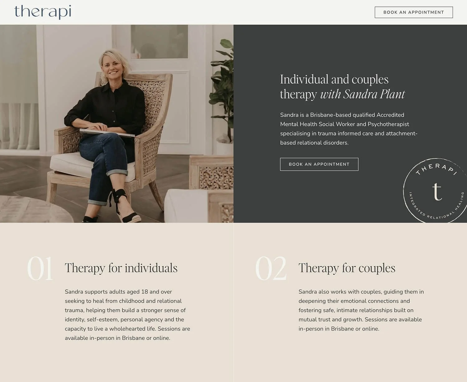
02 // Therapi
Made with: Squarespace
‘Therapi’ is a clean and modern private practice website. The warm neutrals and the shades of blue give a welcoming and professional feel at the same time.
Things I loved ❤️:
The clean and simple style + great use of white space.
The warm and professional photos. They all feel like part of the same photoshoot and have consistency in style.
The ‘therapi’ stamp. Nice additional graphic touch that adds depth to the branding.
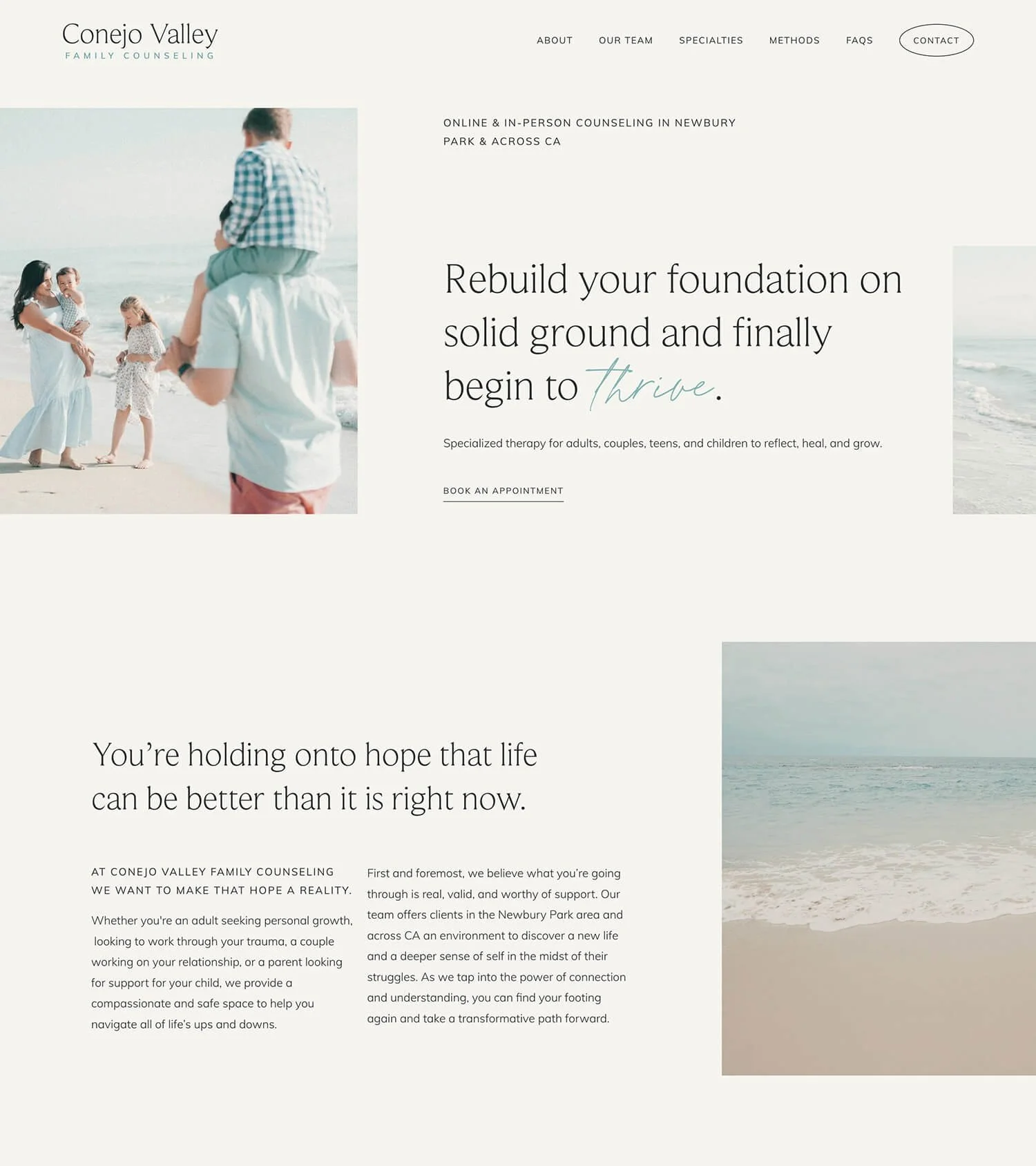
03 // Conejo Valley
Made with: Squarespace
‘Conejo Valley Family Counseling’ is a group practice. Their website feels welcoming, hopeful and carries a certain breezy ocean mood. 💙
Things I loved ❤️:
The soft turquoise accents in the text written with a handwritten font.
The lighthearted feel of the photos.
The supportive tone. You can read phrases like “We’re here to listen”, or “We'll take the time to understand your experience not just as therapists”
04 // Shonagh Wright-Phillips
Made with: Squarespace
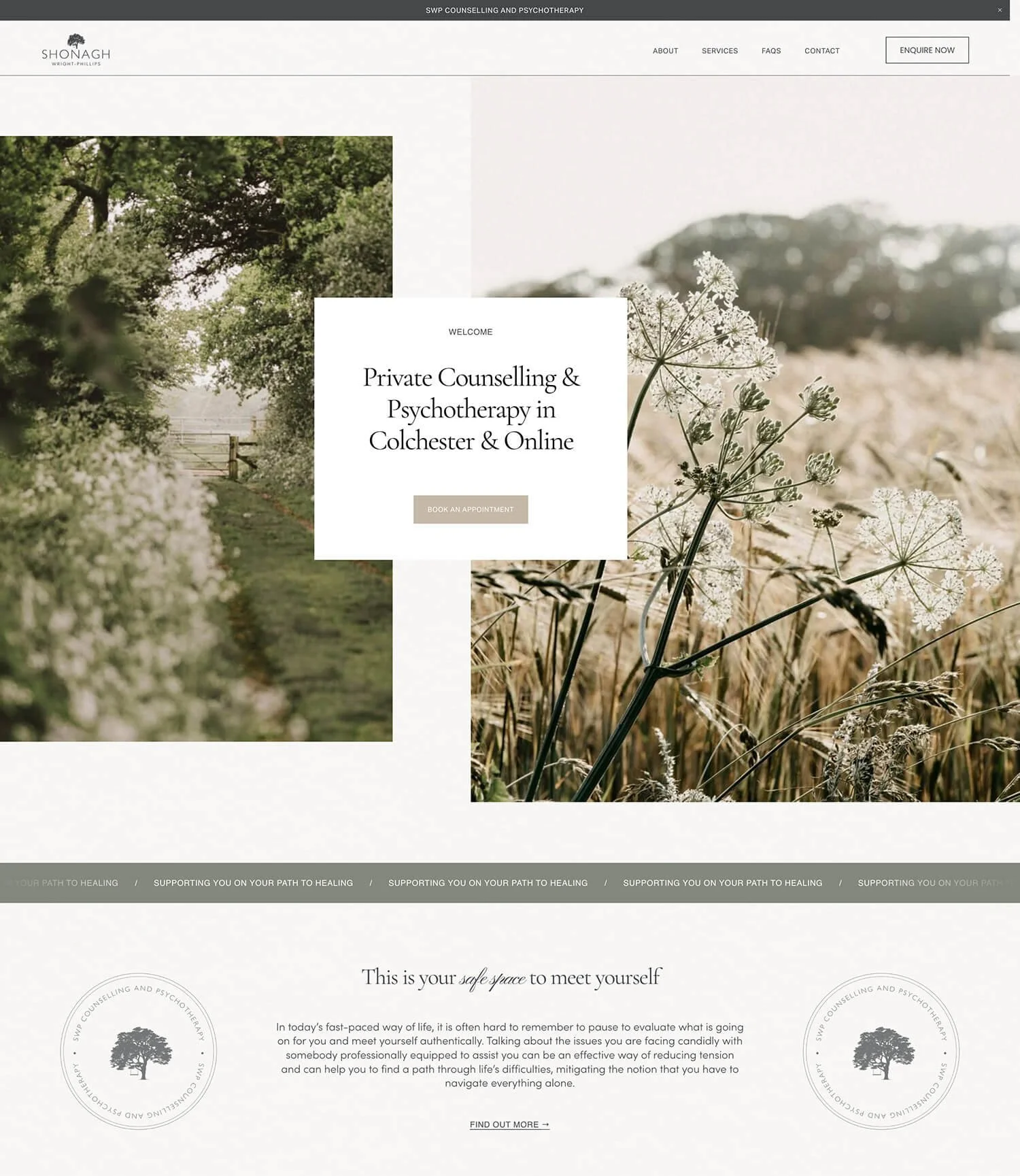
Shonagh’s website feels calm and natural in a gentle way. The colors are quiet and muted rather than vibrant. The photos also bring that feeling of tranquility.
Things I loved ❤️:
The calm and muted colors. They almost feel like neutrals.
The slow-paced nature photography. It feels like it’s time to take pause, time for reflection.
The script font used in some headings. Elegant little accents.
05 // Life Path Therapy
Made with: Squarespace
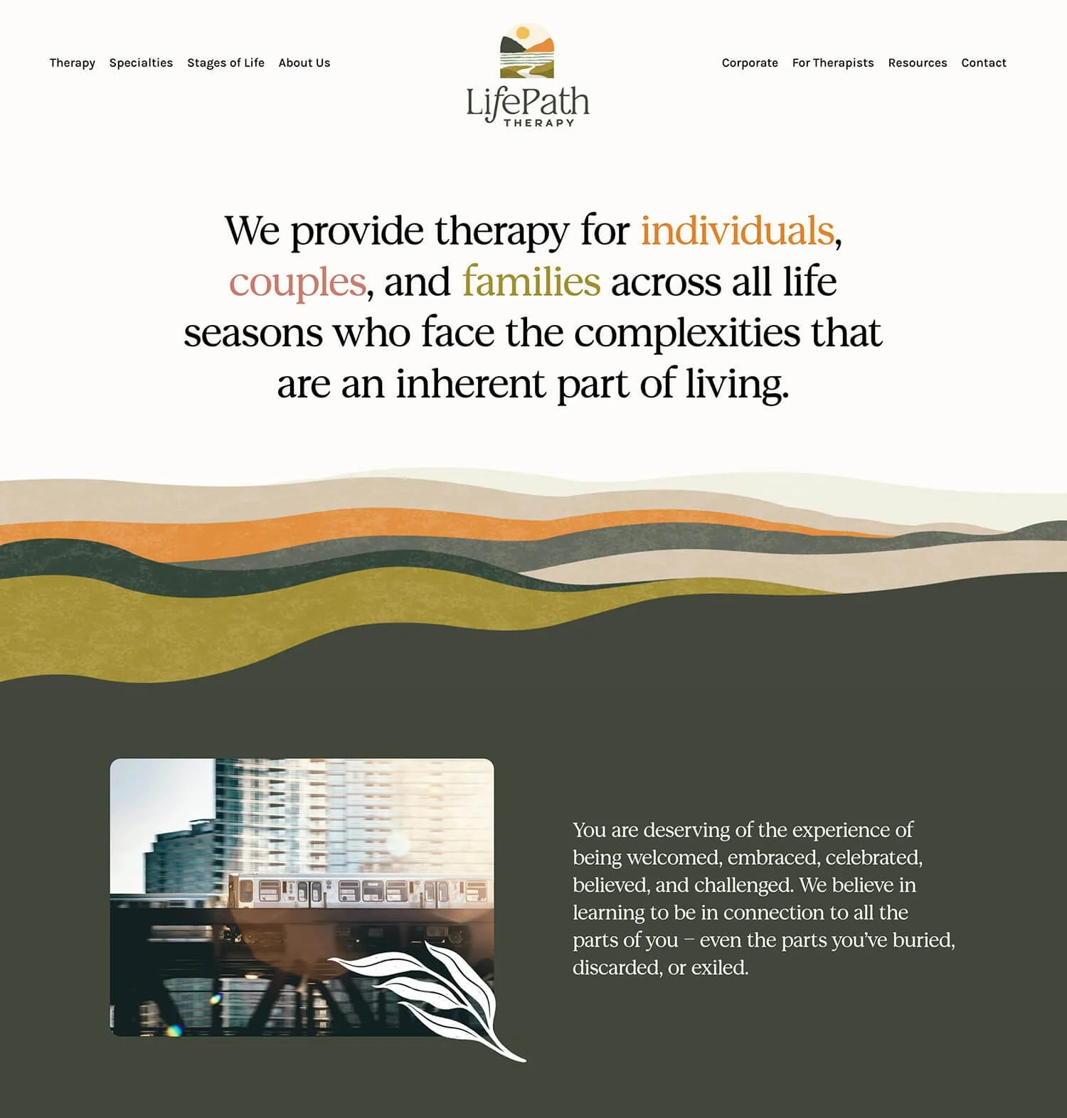
Totally different mood with ‘Life Path Therapy’ and their colorful website. Get ready for some bold colors, rich textures and botanical elements.
Things I loved ❤️:
The bold and joyful color palette. Yellow and orange always bring some happy mood!
The gorgeous textures.
The custom icons that mix botanicals and geometry elements.
06 // Everroot
Made with: Wordpress
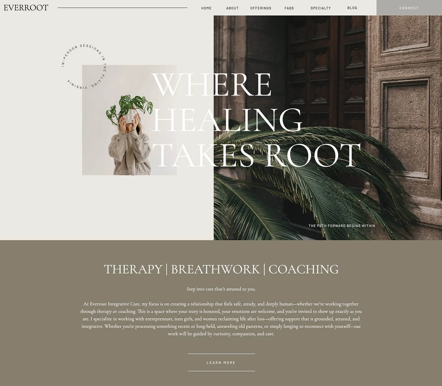
‘Everroot’ website feels quite minimal with its neutral grey and alabaster backgrounds, and just a little bit of color coming through the photos.
Things I loved ❤️:
The minimal style. I especially enjoyed the neutral color palette and the use of white space. Even the buttons felt minimal with just two of the sides being outlined.
The big but short titles. Easy to find what you’re looking for just by scanning the page. Which is basically what a lot of people do - they scan rather than read everything.
The little icon in the footer that looks like a leaf with spiral shaped roots. Nice nod to the brand name.
07 // The Vibrant Tapestry
Made with: Showit
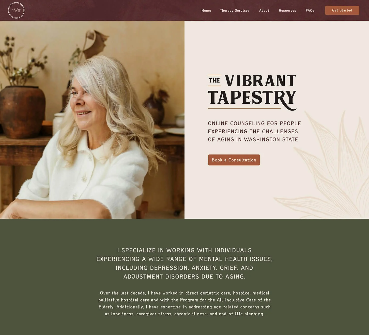
Renee from ‘The Vibrant Tapestry’ is a therapist for aging adults, supporting them through challenges and life transitions so it’s no surprise that her brand and website style feels warm and accepting.
Things I loved ❤️:
The earthy color palette. Feels warm, nurturing and a bit nostalgic.
The soft imperfect font they used for paragraphs and some headlines. Shows history and feels wise with its worn-in look.
The pattern design. Suits the brand name and adds a layer of coziness.
08 //Cup of Tea Psychotherapy
Made with: Squarespace
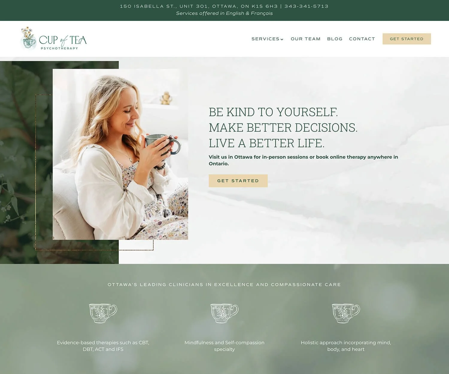
‘Cup of Tea Psychotherapy’ website feels serene, warm and compassionate. It also has a slight whimsical and cozy vibe.
Things I loved ❤️:
The hand-drawn logo. Lovely illustration of cup of tea with yellow flowers inside.
The golden frames and glitter sprinkled across the homepage.
The yellow flower petals used as separate elements and as custom bullet points.
09 // The Well
Made with: Squarespace
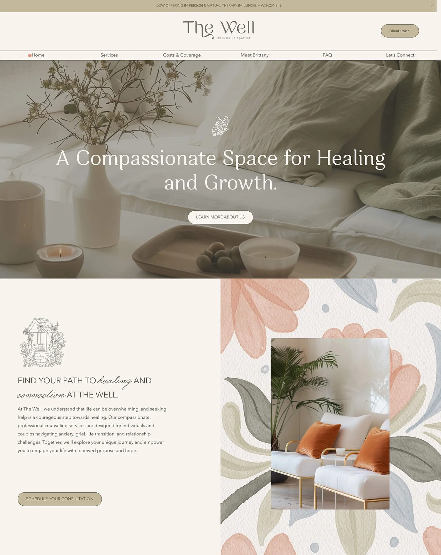
If you’re looking for some feminine and artistic vibe inspiration, check out ‘The Well Counseling Practice’ website. Nice branding work done along with the website design.
Things I loved ❤️:
The water color floral illustrations used as backgrounds.
The logotype with its flowy lines.
The handwritten font used for accents in the headings. Matches the compassionate side of the brand.
10 // Mission Therapie
Made with: Wordpress
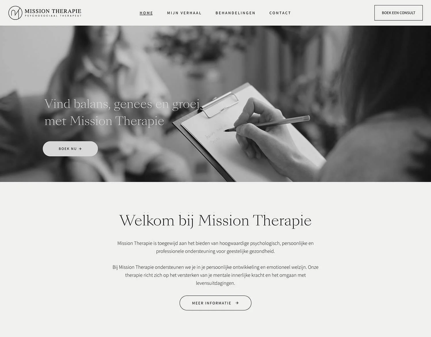
I think that’s the first black and white website of a therapist that I’ve seen. Interestingly, it brings some kind of peace and serenity because of the lack of color.
Things I loved ❤️:
The minimal style. Simplicity in the photos, the colors and layouts. Stripped from excess details and color.
The elegant headline font. Definitely adds a high-end touch.
The simple logo. Even that MT monogram feels minimal.
11 // The Modern Wellness Collective
Made with: Squarespace
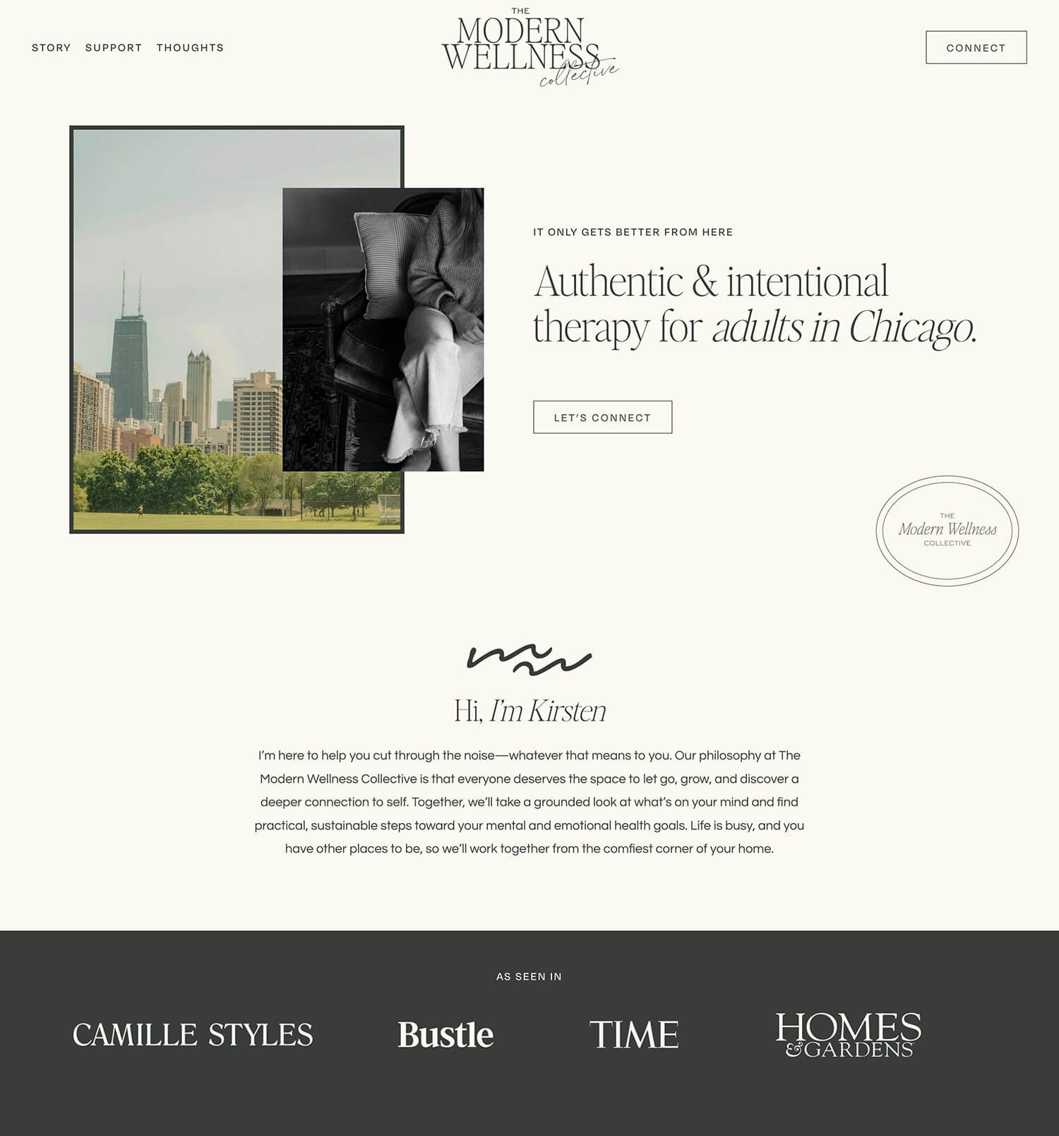
‘The Modern Wellness Collective’ website is another example of clean, almost minimal site. This time in a more urban nostalgic direction.
Things I loved ❤️:
The photos that have a vintage film grain filter and a nostalgic mood. The Chicago skyline shots feel almost as if taken with a kodak portra film.
The muted color palette that feels grounded and refined.
The headline font that has minimalist aesthetic and feels fresh yet rooted in classic editorial traditions.
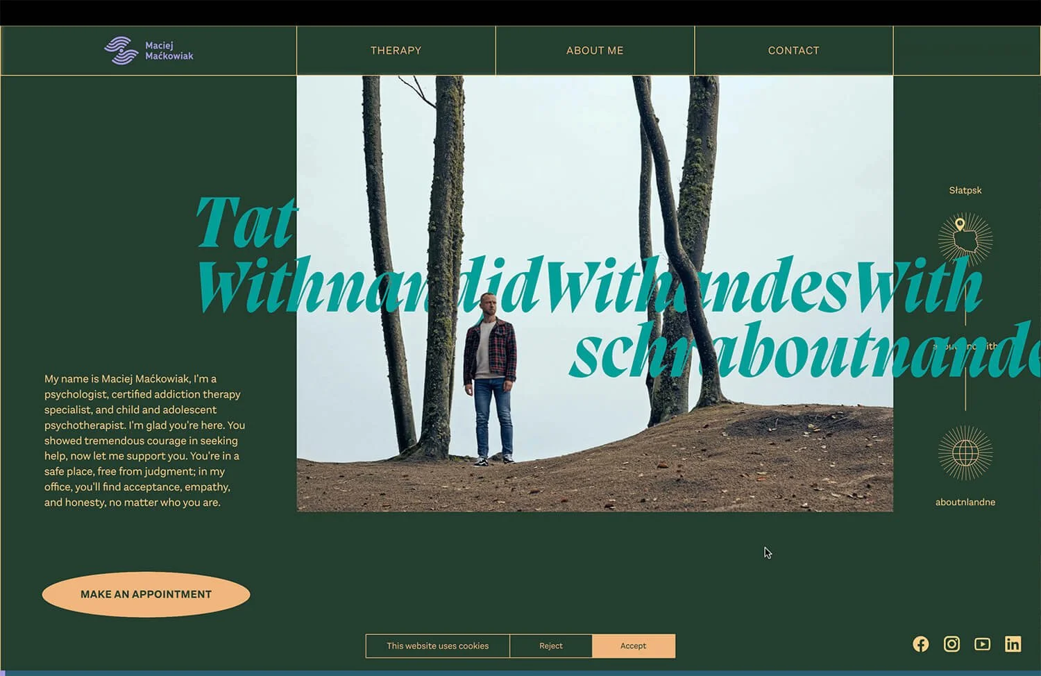
12 // Maciej Maćkowiak
Made with: Webflow
Looking around Maciej Maćkowiak’s website is a whole experience. Totally unexpected, it has a horizontal scroll and changing the screens feels like a journey.
Things I loved ❤️:
The animations and transition effects which contribute a lot to the experience.
The forest motif and the metaphor that therapy is like wandering in a dark forest until you create a new path in it.
The bold green-teal-orange color combination.
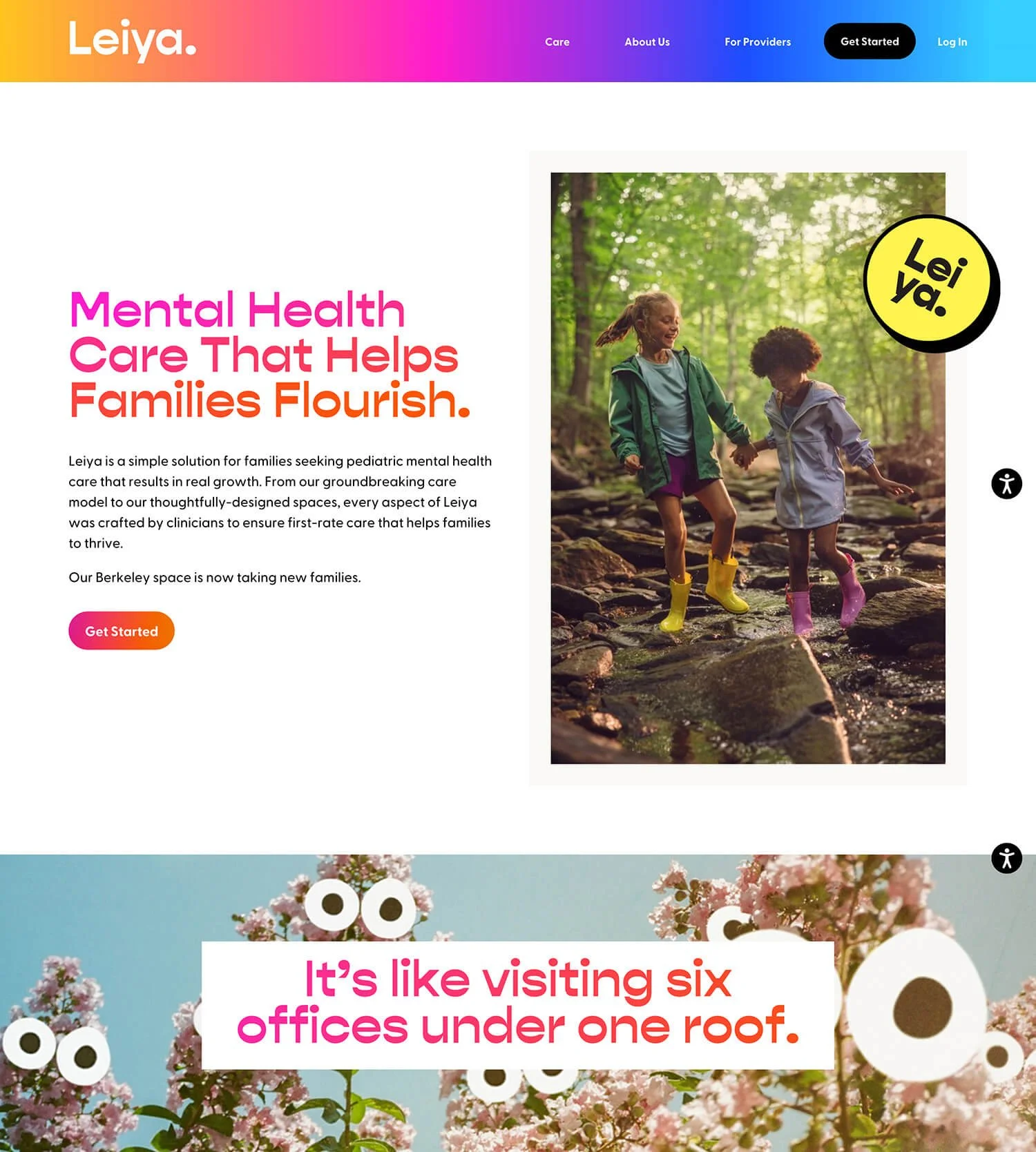
13 // Leiya
Made with: Wordpress
‘Leiya’ website is bold and modern with some really fun details. How about those cartoon eyes looking at you from the trees? 😄
Things I loved ❤️:
The gradients in the navigation, headlines and buttons. It gives the website not just a modern but innovative edge.
The reverse contrast font they used for the headlines. Another modern and sleek element.
The tilted logo badges sprinkled across the homepage. Fun little detail.
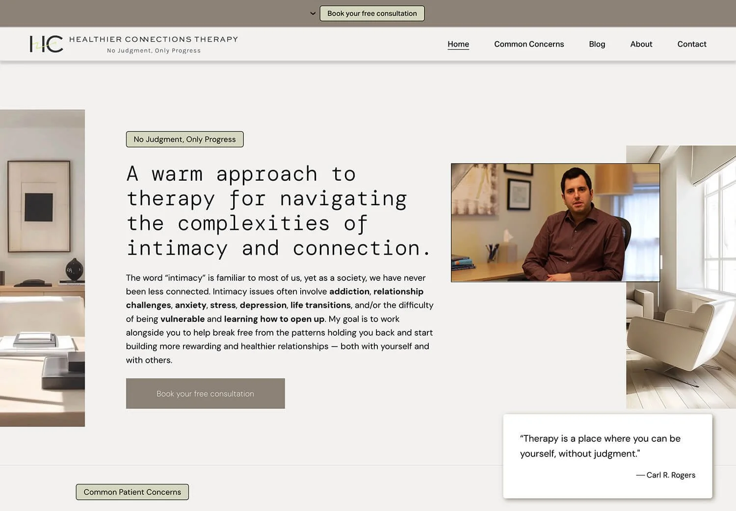
14 // Healthier Connections
Made with: Squarespace
‘Healthier Connections’ website is clean and modern, balancing between clinical look and warm presence.
Things I loved ❤️:
The video in the hero section. Great way to show there’s a real human behind the brand and make connection.
The soft neutral color palette. It gives a calm and welcoming feel.
The minimal logo. It’s recognizable but doesn’t steal attention from the rest.
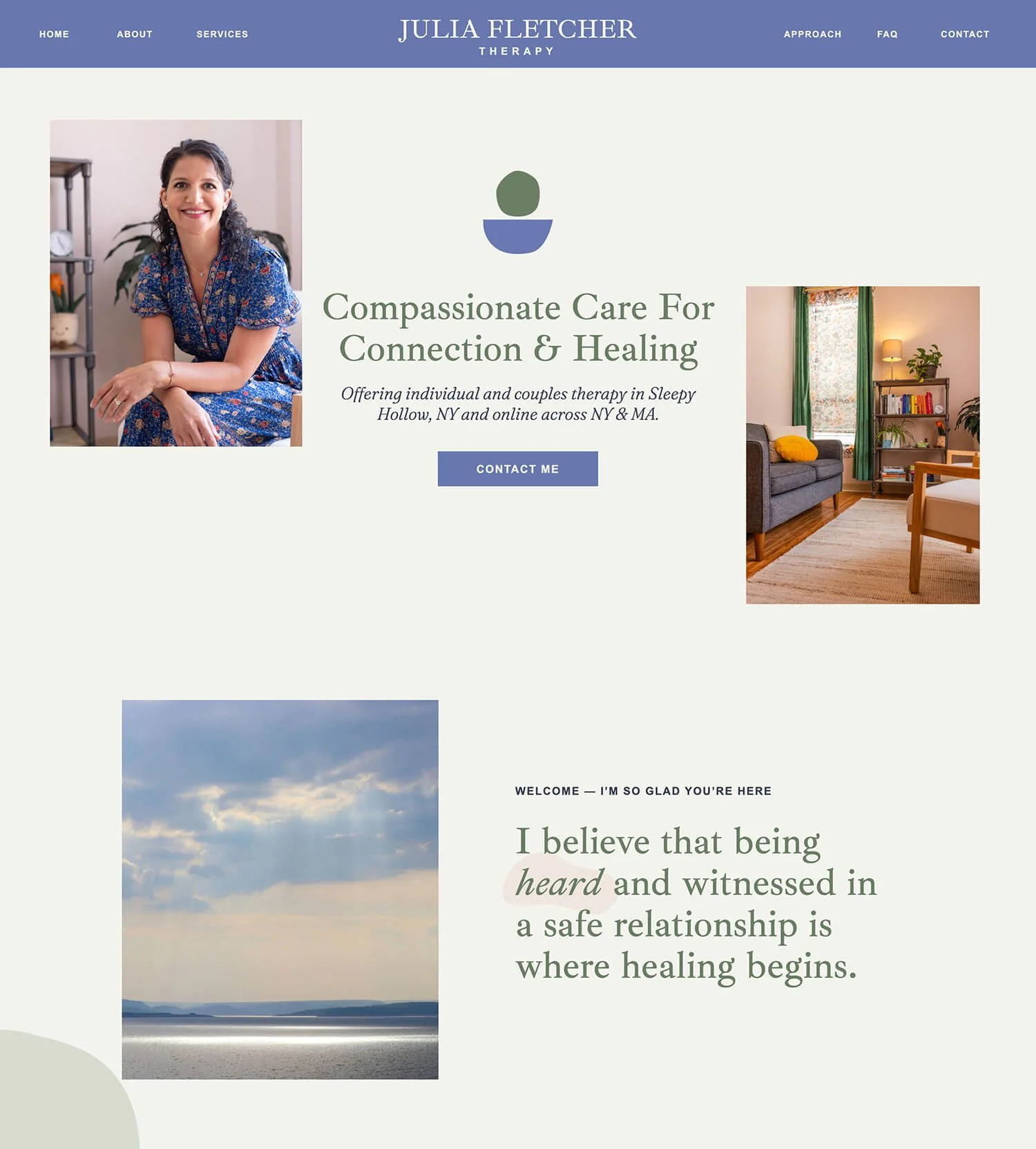
15 // Julia Fletcher
Made with: Showit
Julia’s website has a clean style with a calm, welcoming aesthetic.
Things I loved ❤️:
The calming color palette. The soft, muted tones that create a therapeutic, safe atmosphere.
The down-to-earth human language. She says “Hi, I’m Julia”, “I’m so glad you’re here” etc.
The photos with the sun breaking through clouds. It enhances the optimistic messaging.
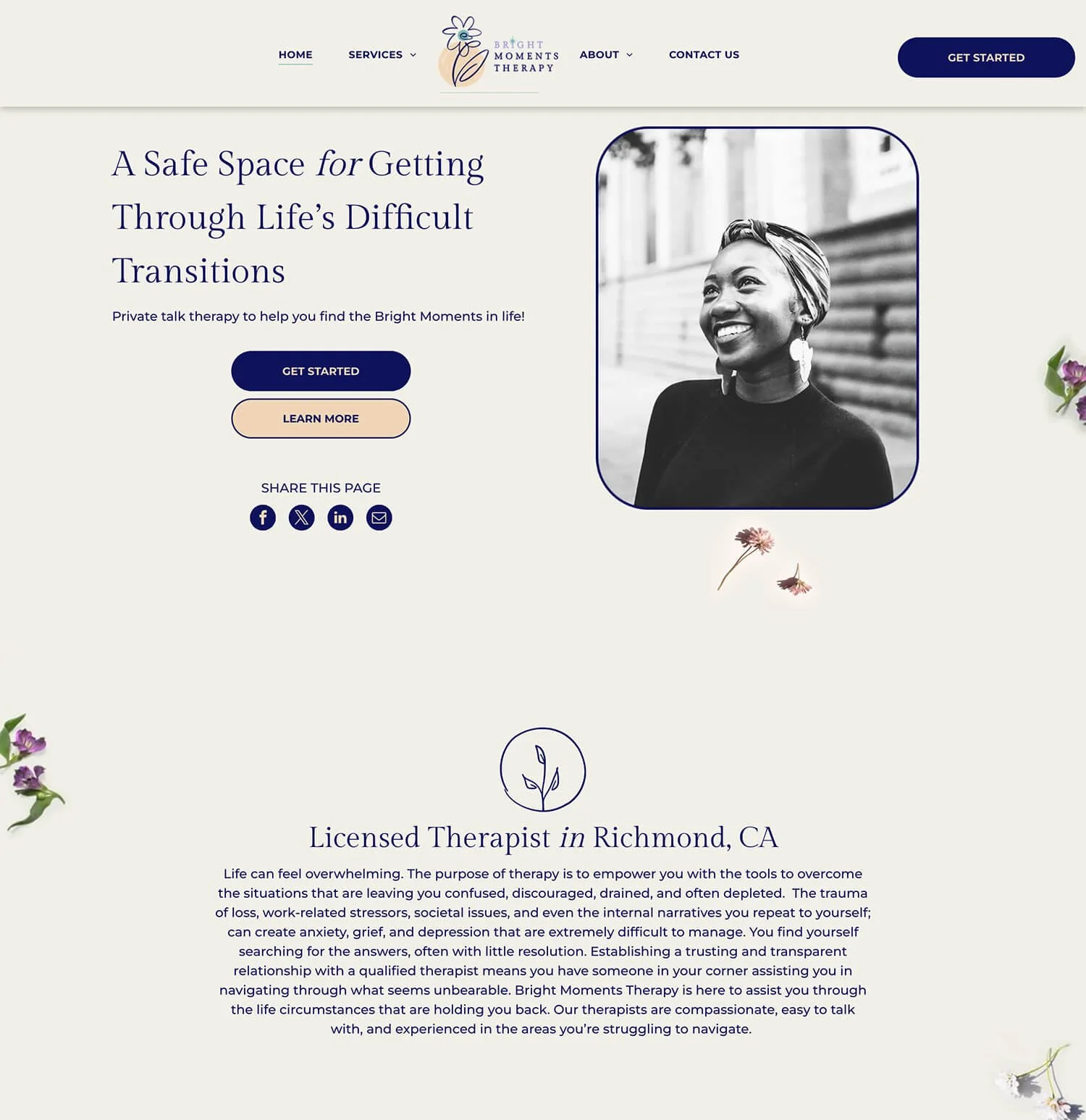
16 // Bright Moments Therapy
Made with: Duda
‘Bright Moments Therapy’ website feels optimistic and approachable. Tangerine-blue combo, tiny flowers sprinkled around, and a smiling face right from the beginning of the homepage, what’s more friendly than that?
Things I loved ❤️:
The optimistic vibe. Even the brand name sounds hopeful.
The hand-drawn logo and icons used across the homepage.
The flower petals sprinkled around the site.
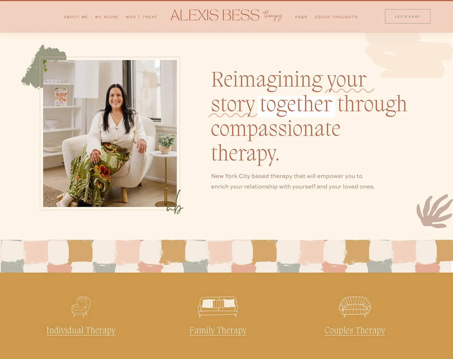
17 // Alexis Bess Therapy
Made with: Squarespace
Vibrant pastels and boho chic aesthetic 😍 That’s what you get when you land on ‘Alexis Bess Therapy’ website. Sooo much personality infused into it. Nicely done! 👏
Things I loved ❤️:
The vibrant pastel color palette. It gives a truly unique look to a therapy practice.
The custom pattern that match the laid-back boho style.
The organic illustrations that give a hand-carfted feel.
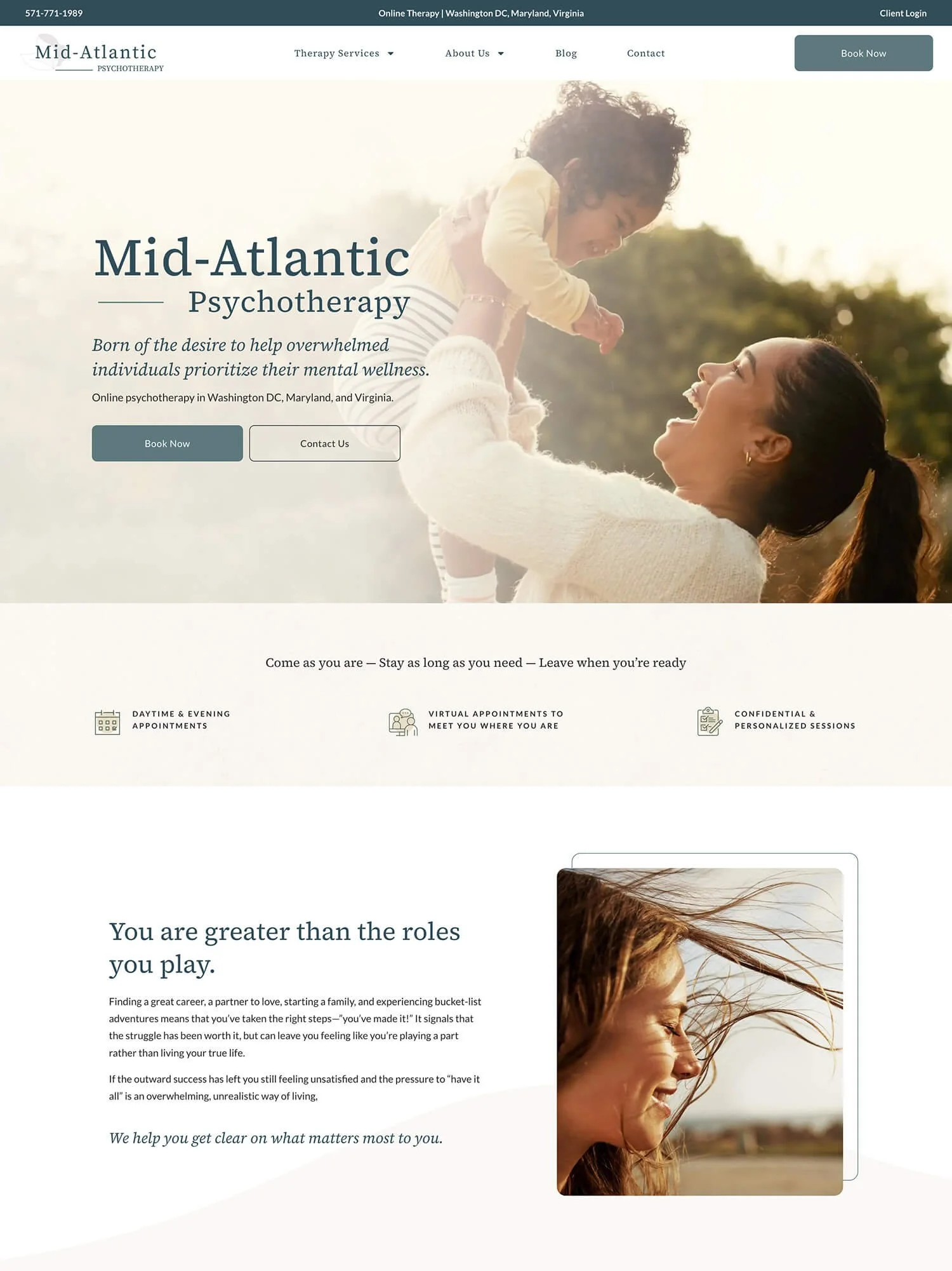
18 // Mid-Atlantic Psychotherapy
Made with: Wordpress
‘Mid-Atlantic Psychotherapy’ website is a classic example. When it comes to design they took a rather traditional approach having a clean and simple style, leaning towards clinical look.
Things I loved ❤️:
The photo selection. Although these are stock photos they share the same style and feel like they belong together which creates consistency.
The branded icons. You can see these in a multiple places across the homepage.
The tranquil color palette. Going with a blue-green, cream and a lots of white is a classic choice for health and wellness brands since it feels trustworthy and professional.
19 // Gem State Counseling
Made with: Wordpress
‘Gem State Counseling’ website is another bold and vibrant case study. Full of color and happy mood.
Things I loved ❤️:
The bold color palette. It feels joyful and friendly.
The logo that uses a playful script and literally has gems in it
The colorful gem shaped elements that are sprinkled around the pages.
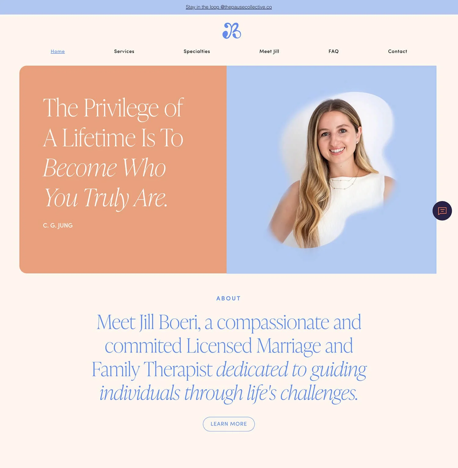
20 // Therapy with Jill B
Made with: Wix
There’s some warm and hopeful energy coming from Jill’s website. Nice balance between approachable and credible.
Things I loved ❤️:
The optimistic color palette. The soft peachy-coral feels inviting while the blue evokes feelings of tranquility and trust.
The custom JB monogram. They used a soft curvy script style which feels personal and informal, as well as warm and friendly.
The elegant serif font that signals refinement.
21 // Therapy in London
Made with: Cloudflare
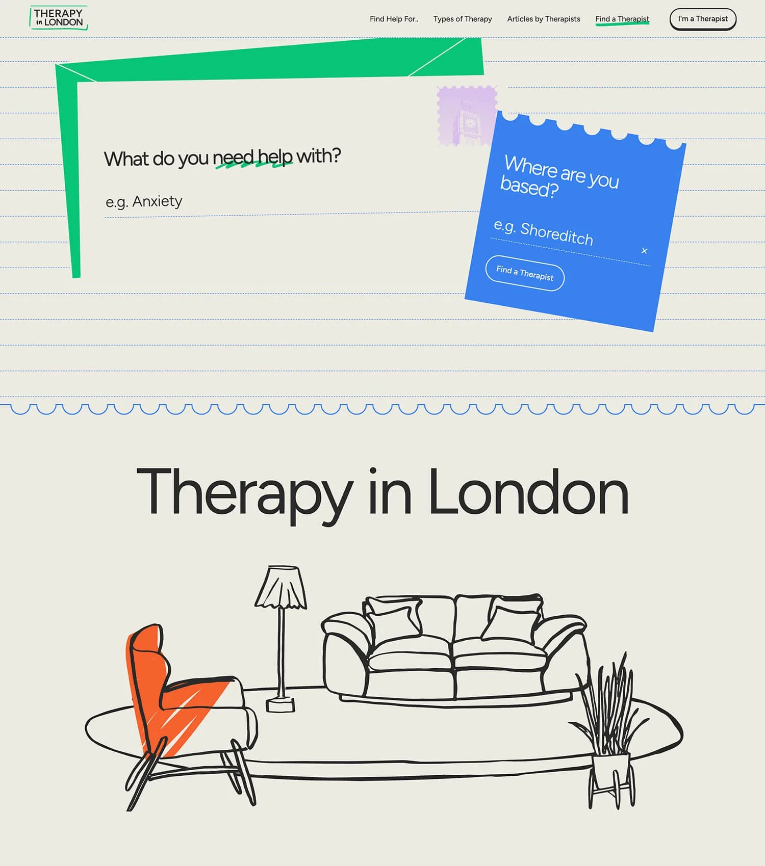
‘Therapy in London’ isn’t a group practice, it’s more more like a directory but it deserves a place in this selection because of the unique website design.
Things I loved ❤️:
The handdrawn illustrations. They build up a playful yet professional look.
The animations. It’s a fun experience seeing the illustrations get colored as you scroll down the pages.
The notebook aesthetic. Some sections literally look like torn paper pages.
You’ve got the inspiration. Now what?
If you need help with the design, definitely check out my Squarespace website design service. Let’s bring your vision to life and start building your dream website. ✨
