10 Website Do's and Don'ts Every Business Owner Should Know
Hey there! 👋 So you're building a website (or thinking about refreshing your current one). That's exciting! But let me tell you, I've seen a lot of websites over the years, and there are some common mistakes that can really hold your site back. The good news? They're totally fixable.
Let's dive into 10 do's and don'ts that'll help your website actually work for you.
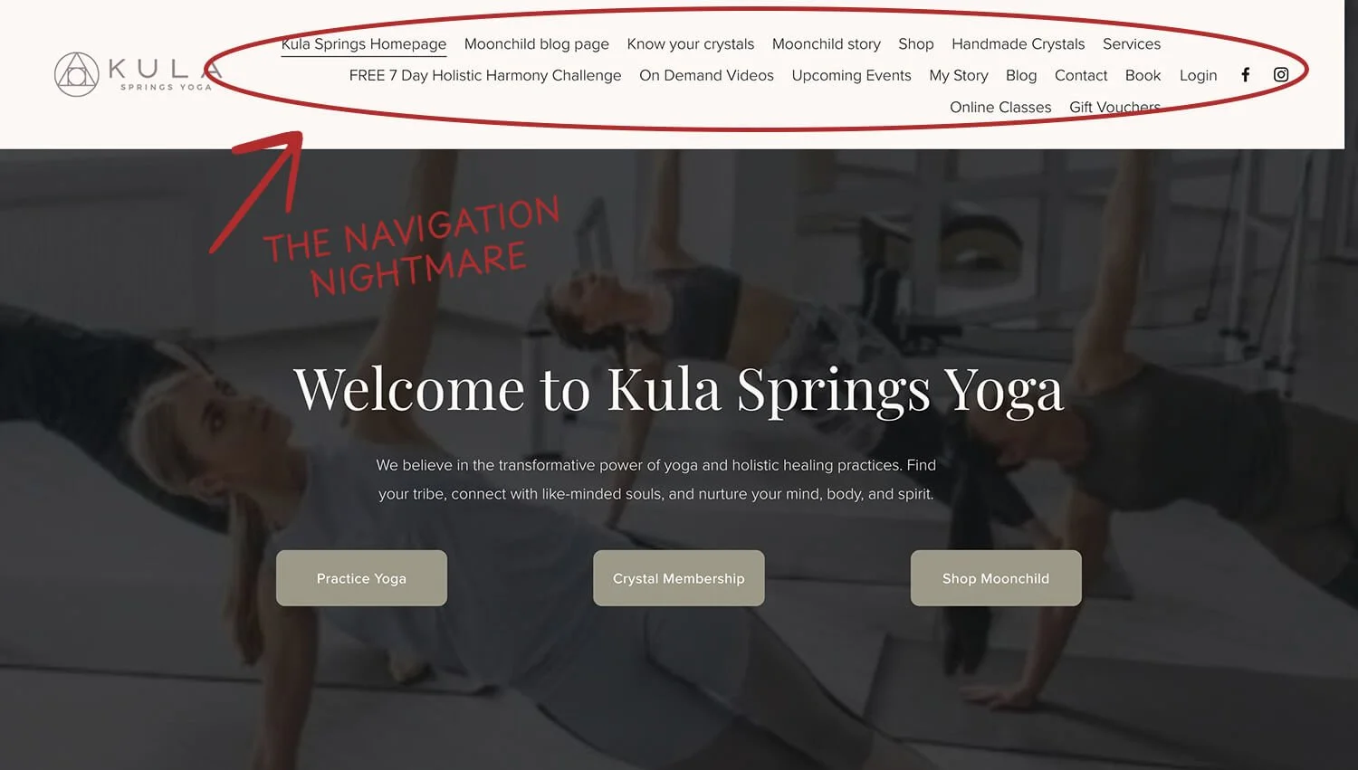
✗ Don't cram your website menu with every single page on your site.
I've seen menus with 12+ links in the top navigation, and honestly? It's overwhelming. Visitors don't know where to click first, so they often just... leave.
Here’s an example. Before we started on Rebecca’s website, she had 16! items on her website menu. It was messy and it felt overwhelming.
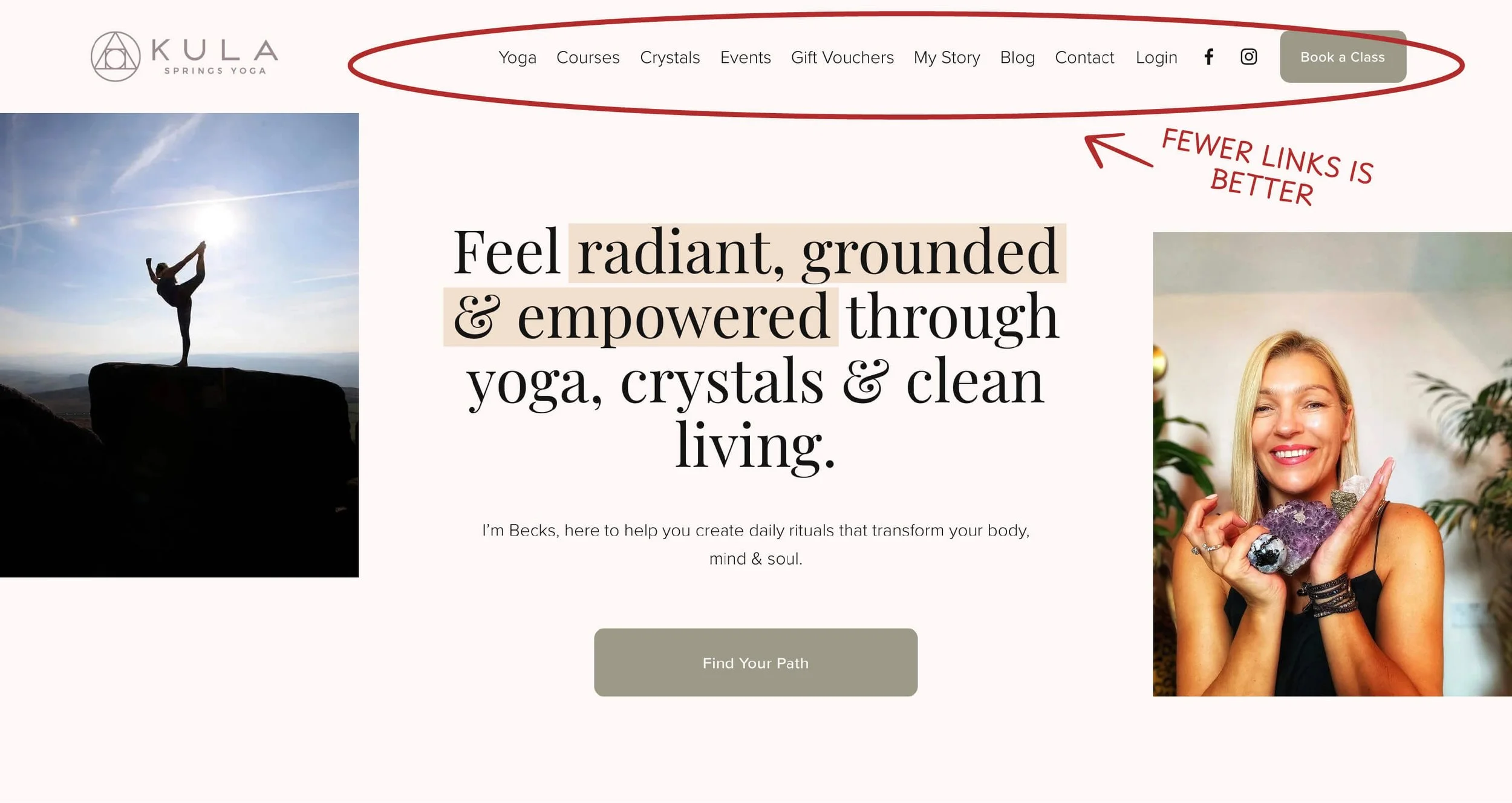
✓ Do keep your main navigation simple and intuitive.
Aim for 5-7 main menu items max. Think about what your visitors actually need to find quickly. You can always use dropdown menus or a footer for secondary pages.
Let’s take a look at the same example again. After the website refresh, we reduced the number of website menu items dramatically so that visitors can easily find what they’re looking for, and do it fast.
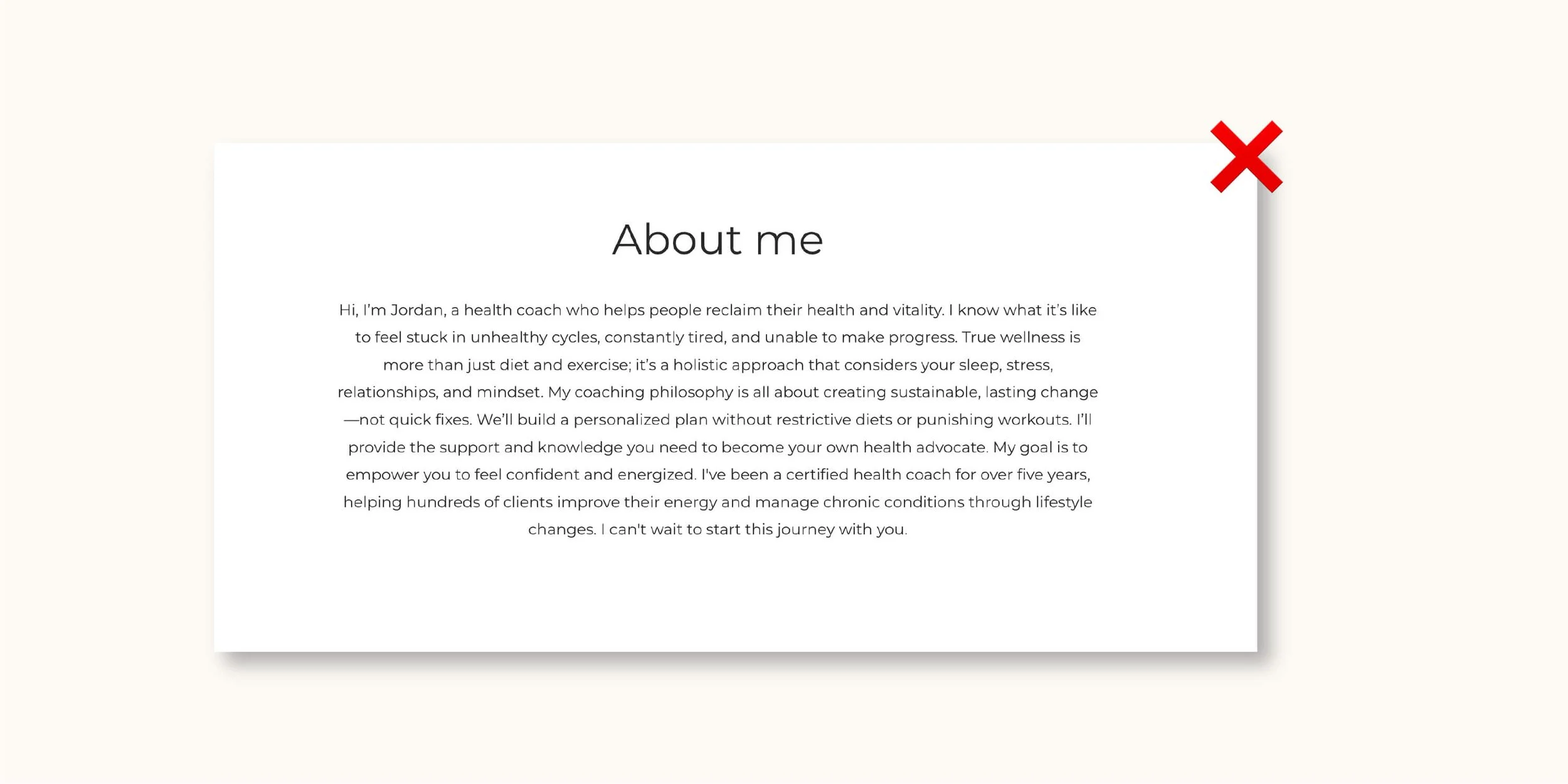
✗ Don't fill your pages with giant walls of text.
I know you have a lot to say about your business, but people don’t read huge paragraphs. People will just scroll right past them.
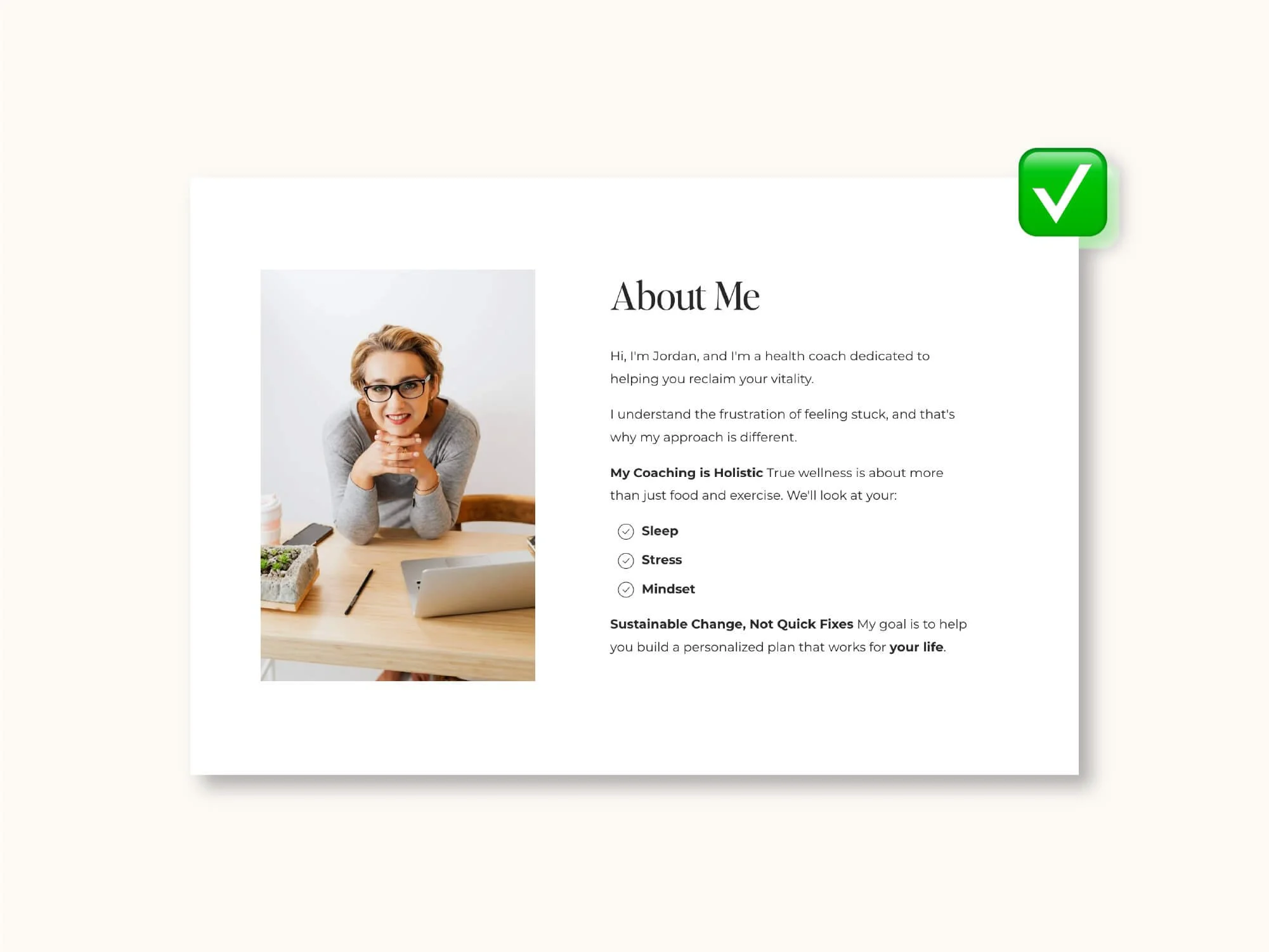
✓ Do make your content scannable.
Use short paragraphs, subheadings, and bullet points. Break things up visually so visitors can quickly find what they're looking for. Think bite-sized chunks, not novel chapters. 📖
✗ Don't use blurry, pixelated, or generic stock photos.
Nothing screams "I didn't really try" like a fuzzy image or that overused stock photo of people jumping in the air. Your website deserves better!
✓ Do invest in high-quality, authentic images that represent your brand.
This could be professional photos of you, your work, your team, your products, or just photos that capture your brand vibe. Real beats generic every single time. 📸

✗ Don't forget to check how your site looks on mobile.
I can't tell you how many times I've visited a site on my phone and found text that's microscopic, buttons I can't tap, or images that are cut off. More than half your visitors are probably on mobile!
✓ Do design with mobile users in mind from the start.
Test your site on different devices. Make sure buttons are big enough to tap, text is readable without zooming, and everything loads quickly. Mobile-first isn't just a buzzword, it's essential. 📱

✗ Don't upload massive, uncompressed images.
Those 5MB photos might look crisp, but they're killing your loading speed. Visitors won't wait around. Studies show people abandon sites that take more than 3 seconds to load.
✓ Do optimize your images before uploading them.
Compress them, resize them for web use, and choose the right file format. Your site will load faster, and Google will love you for it too. ⚡ One tool I use all the time for reducing the size of images is TinyPNG 👌
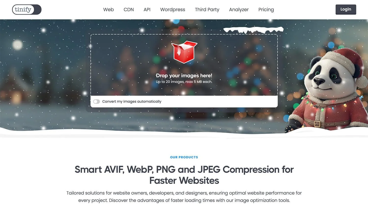
Source: https://tinypng.com/
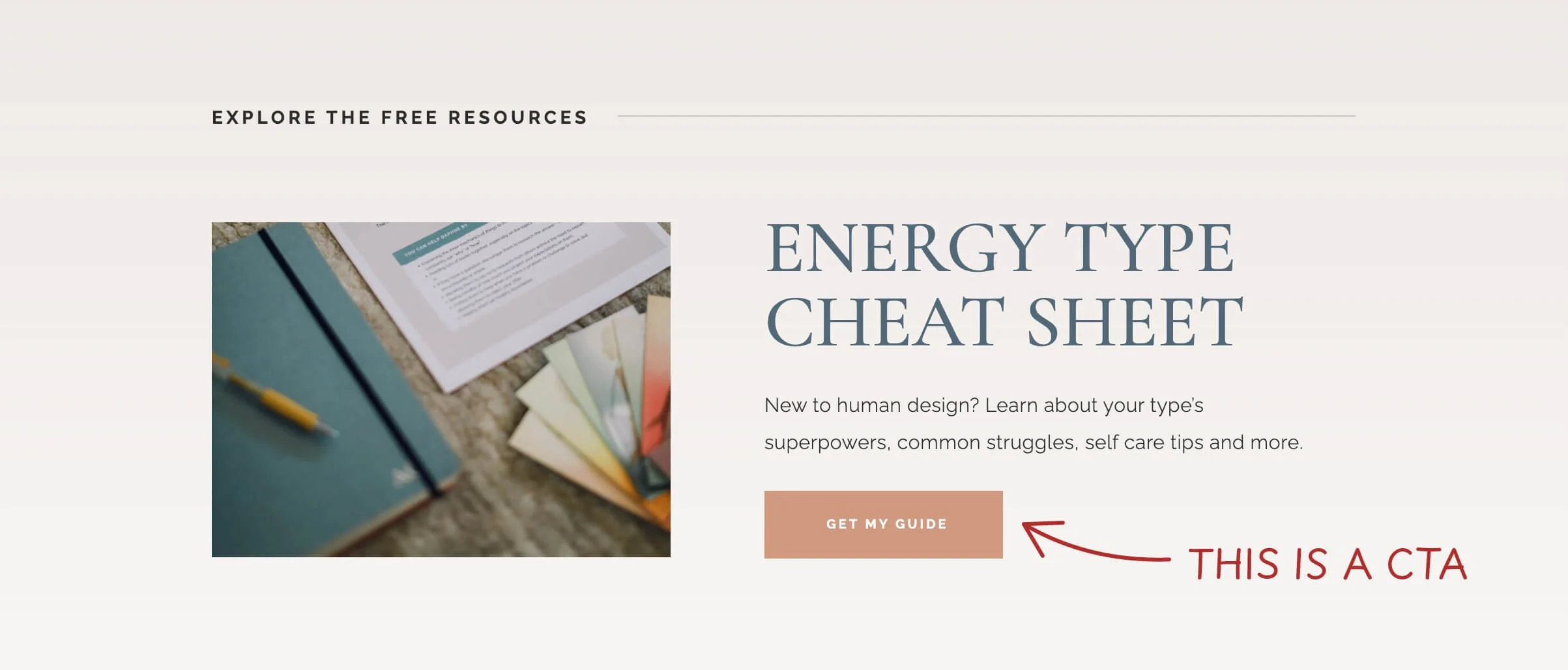
✗ Don't be vague about what you want visitors to do.
Pages that just… end, with no clear next step, are a missed opportunity. Don't make people guess what to do next.
✓ Do include clear calls-to-action (CTAs) on every page.
Whether it's "Book a Consultation," "Shop Now," or "Get in Touch," tell people exactly what to do next. Make those buttons stand out and use action-oriented language. 🎯
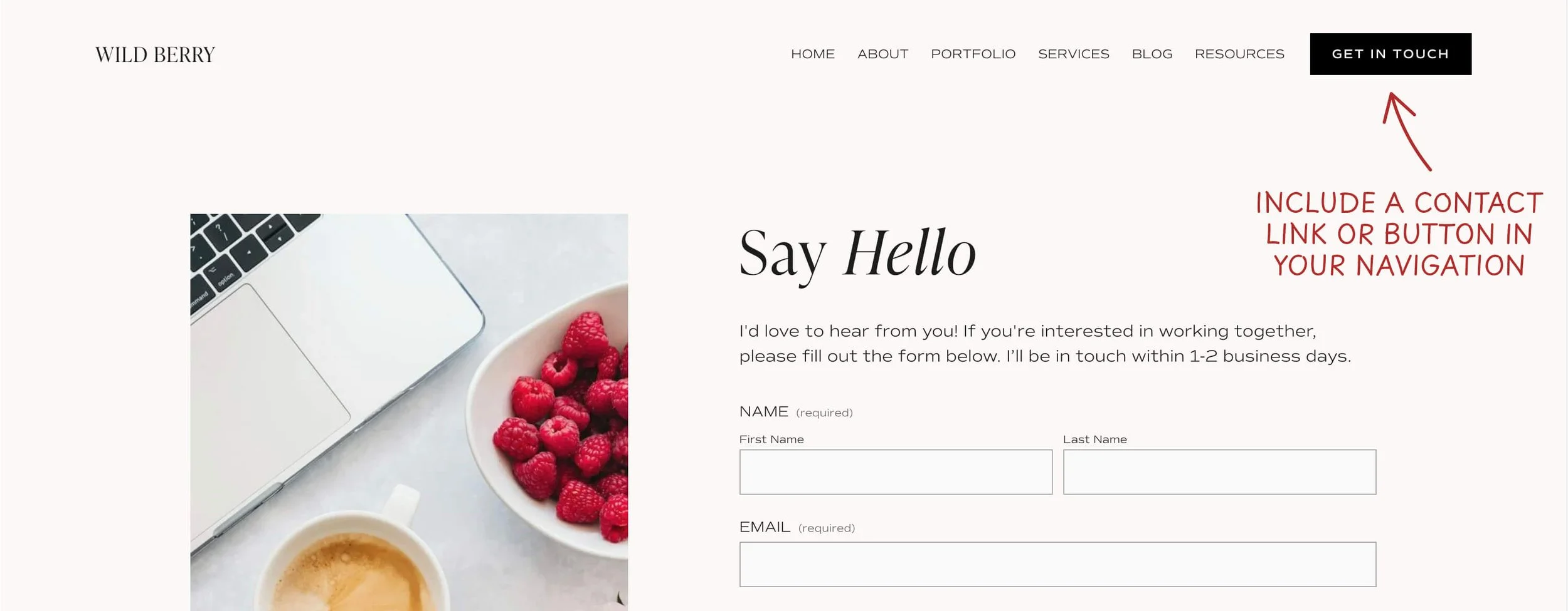
✗ Don't make it hard for people to contact you.
I've seen businesses bury their contact page in a dropdown menu or forget to link to it from key pages. If people can't figure out how to reach you, they'll give up and move on to a competitor.
✓ Do make it super easy for people to reach you.
Put contact info in your footer or create a dedicated contact page. Have a clear "Contact" link in your main navigation. The easier you are to reach, the more inquiries you'll get.
✗ Don't try to fill every inch of your page.
When there's too much going on, nothing stands out. It's visually exhausting and actually makes important information harder to find.
✓ Do embrace white space in your design.

Give your content room to breathe. Strategic empty space actually draws attention to what matters most and makes your site feel more modern and professional. Less really is more. ✨
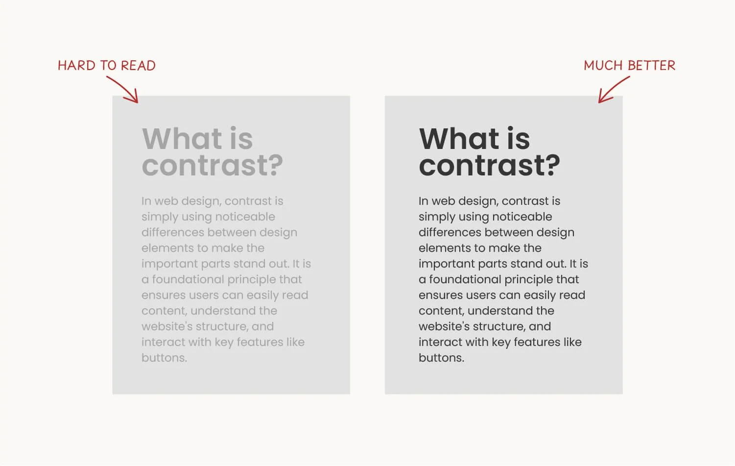
✗ Don't use low-contrast color combination.
Like light gray text on a white background. Sure, it might look "aesthetic," but if people can't read it, what's the point? This is especially tough for people with visual impairments.
✓ Do ensure your text has strong contrast against its background.
Dark text on light backgrounds (or vice versa) is easiest to read. Your content should be accessible to everyone, and good contrast makes everything more professional-looking anyway. 🎨
✗ Don't leave old, irrelevant content sitting on your site.
Nothing says "I don't update this" like a blog with the last post from 2019, or a homepage banner promoting a sale that ended two years ago. It makes your whole business seem inactive.
✓ Do keep your content fresh and relevant.
Regular updates show you're active and engaged with your business. This doesn't mean you need to blog every week, but do remove outdated info, refresh your content, and keep things current. 🔄

The Bottom Line
Your website is often the first impression people get of your business, so make it count! These do's and don'ts aren't about following strict rules. They're about creating a better experience for your visitors (which ultimately means better results for you).
Remember: a good website isn't about being fancy or trendy. It's about being clear, helpful, and easy to use. Focus on your visitors' needs, and you can't go wrong.
Need help implementing any of these on your Squarespace site? Feel free to take a look at my website design service or simply reach out. I'd love to help! 🧡