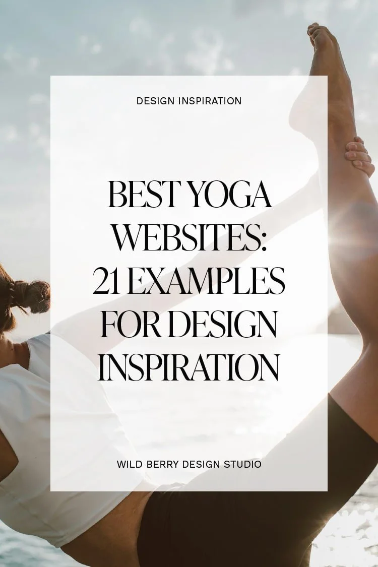
Best Yoga Websites: 21 Examples for Design Inspiration
Need ideas for your yoga website design? 💡
Whether you’re building a new site from the ground up or just want to refresh your existing yoga website, gathering some inspiration is a place to start.
In this post, I've gatehred 21 of the best yoga websites out there. 🌟 The list features different businesses:
studios and centers exclusively dedicated to yoga
hybrid studios. Turns out yoga goes well with other modalities such as pilates or barre, for example.
independent yoga teachers
No matter the background, each case study can offer a unique lens and inspire your for your own website design. Ready to flow through some seriously inspiring examples? Let’s go. 💖
01 // InnSaei Studio
Made with: Tilda
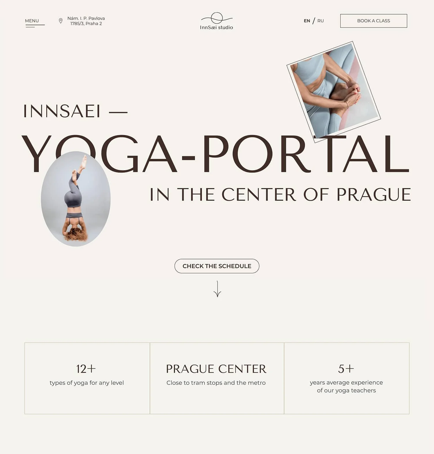
Starting our collection with ‘InnSaei’ website made for a yoga studio in Prague. Notice how the clean layouts and generous use of white space bring a sense of calm? Definitely matches the relaxing atmosphere of the place.
Things I loved ❤️:
The frames of the photos. Besides the typical rectangular shaped images there are also a lot of ellipses which makes the layouts interesting without being cluttered.
The animations and the objects like headlines and photos that move when scrolling through the homepage.
The minimal style.
02 // Living Barre & Yoga
Made with: Wordpress

‘Living Barre & Yoga’ website feels very soft and full of warmth. I’m in love with the light seashell pink background! 😍 They definitely took a modern and welcoming approach with the site design. You can tell by the choice of fonts and colors, and even the rounded corners of the images and the shape of the buttons.
Things I loved ❤️:
The carousel with the different type of classes - super easy to learn what the studio offers.
The welcoming video from Abrianna, the owner - makes the brand feel more human and approachable.
The soft and warm color palette.
03 // Pani Joga
Made with: Webflow
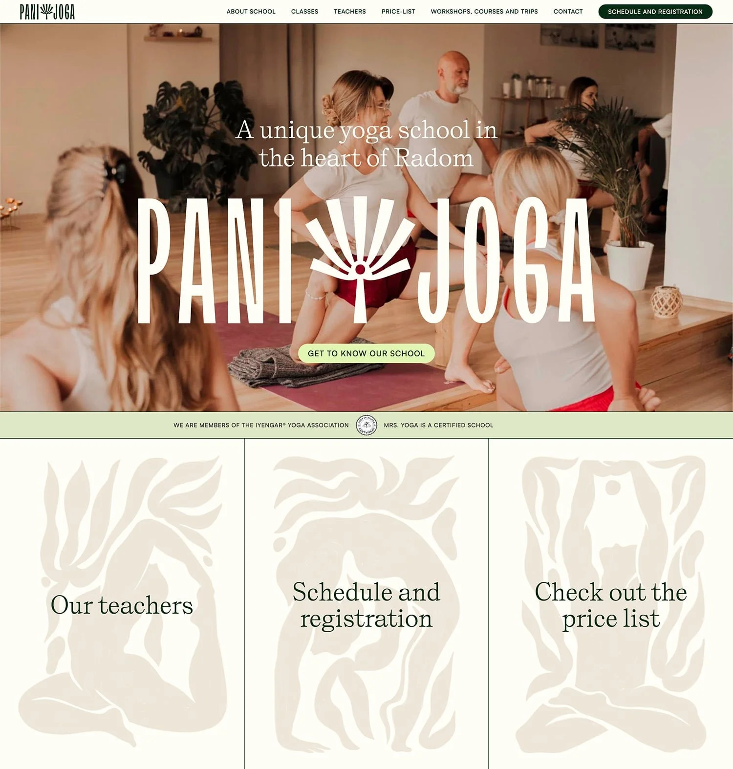
‘Pani Joga’ website is full of personality. You can always tell when a business has invested in branding instead of jumping straight ahead to website design. Take a look at those gorgeous custom illustrations in boho style. Nicely done! 👏
Things I loved ❤️:
The meaningful logo. Fans of Iyengar would probably figure it out but check out the about page if you’re curious about the symbolism.
The custom illustrations. Definitely makes the brand and website different and memorable.
The cozy welcoming but still fresh and playful color palette.
04 // Samya Studios
Made with: Netlify
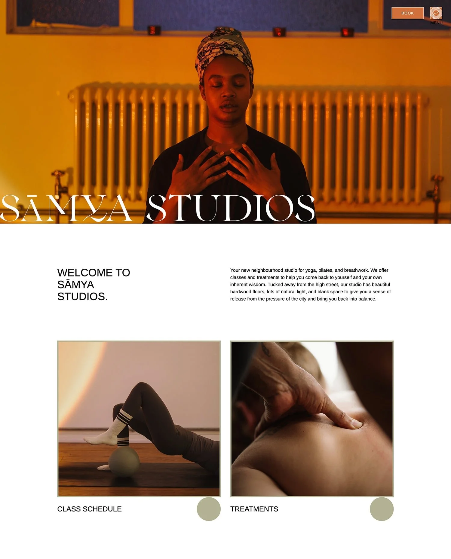
‘Samya Studios’ style is simple and elegant yet fresh and exciting. Unlike many yoga websites that rely on soothing colors to bring a tranquil mood, here we see unexpected splashes of bright orange and lime green.
Things I loved ❤️:
The surprising earthy neutrals and bright colors combo.
The textures used for background images.
The ‘Who we are’ page because of the message from the founder and the portraits of the teachers. It’s always nice to see the faces of the real people behind the brand.
05 // Alma
Made with: Shopify
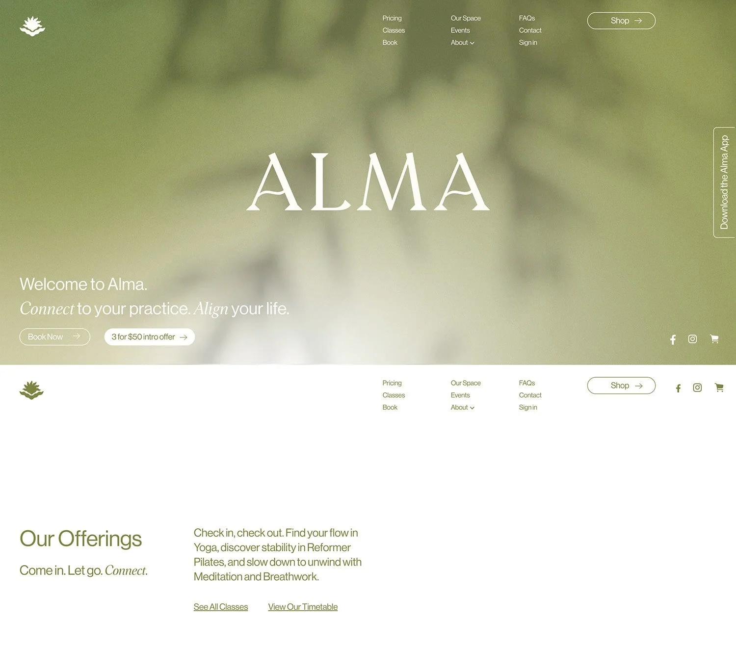
‘Alma’ website feels clean, calm and rejuvenating. We can see lots of pure white in the backgrounds as well as a lush shade of green for the text.
Things I loved ❤️:
The clean and nourishing style that evokes a feeling of ease.
The subtle video background in the Hero section.
The organic boho logo.
06 // MYA
Made with: Wordpress
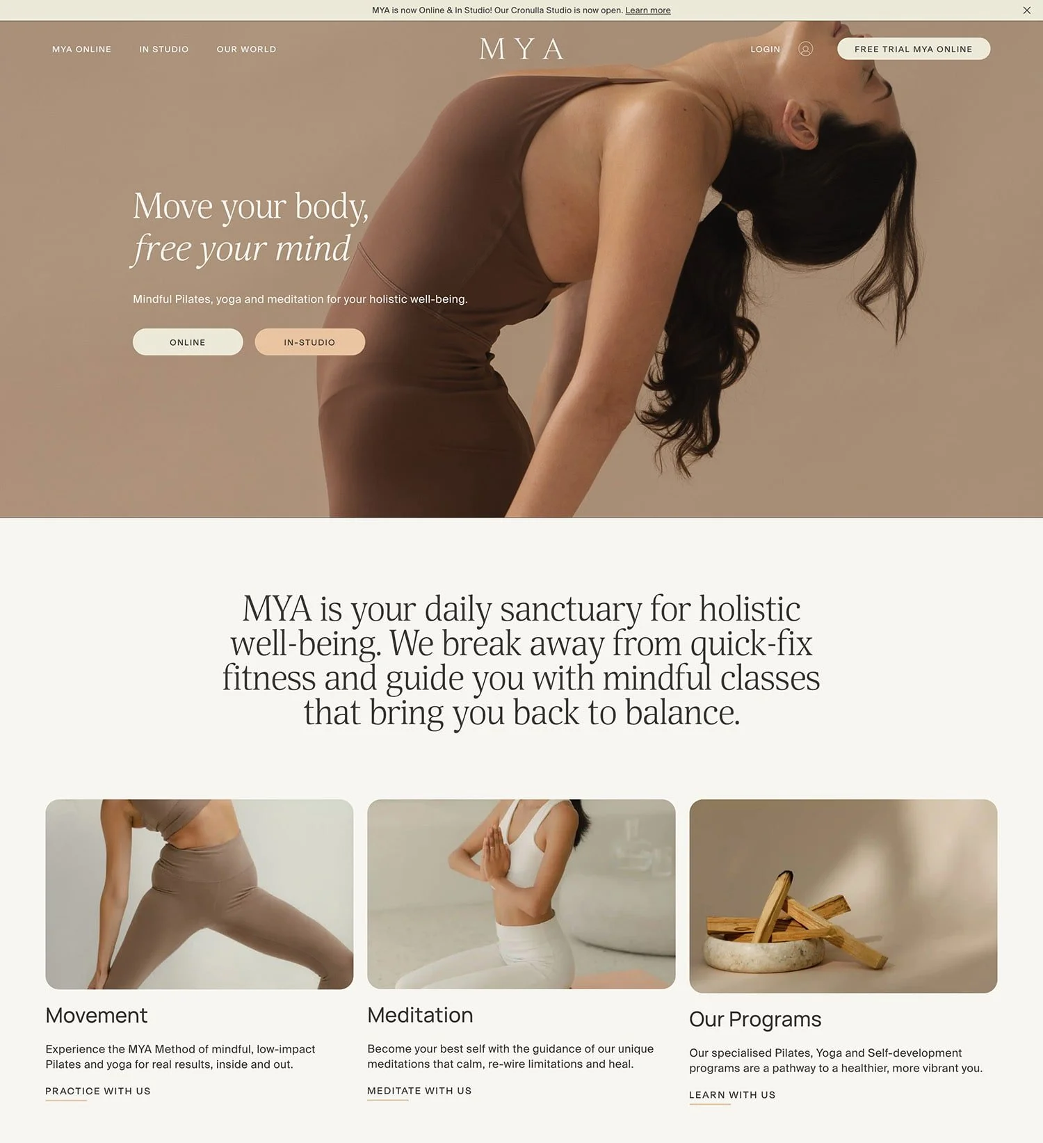
‘MYA’ is all about holistic wellbeing and empowering their community to experience deep, authentic transformation. Their website feels welcoming and high-end, breathable and balanced.
Things I loved ❤️:
The neutral color palette.
The menu dropdowns that include photos.
The minimal geometric graphic illustrating MYA’s method and the four pillars of wellbeing - mind, body, beauty and spirit. You can see it on the homepage, and there’s an animated version on the about page as well.
07 // The Goddess Movement
Made with: Wordpress
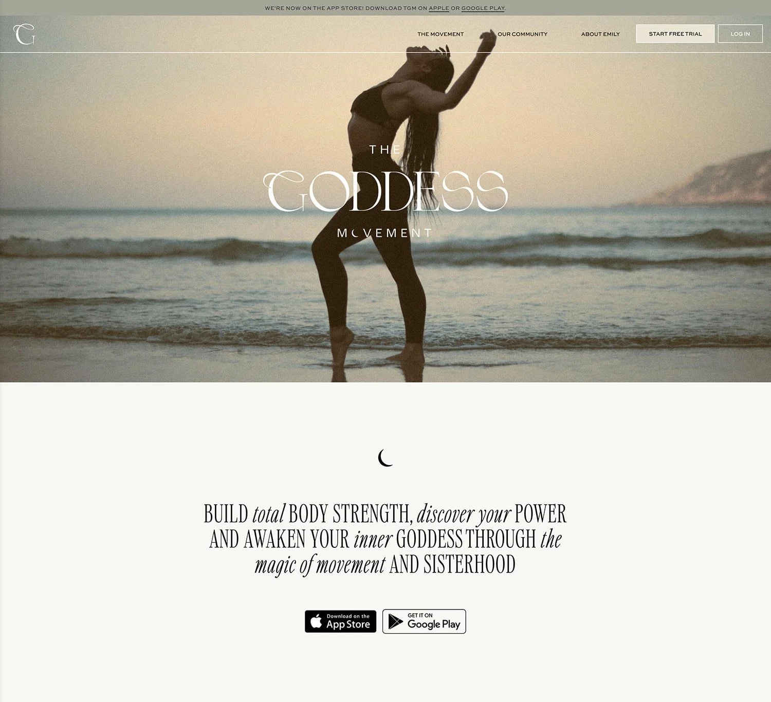
This one is very interesting. ‘The Goddess Movement’ vibe is magical and empowering, graceful and fearless at the same time. Imagine femininity and fierceness under the same roof. Worth a look.
Things I loved ❤️:
The ‘G’ in the logo. Looks flowy and with an edge at the same time.
The tiny crescent moon used in some headlines and as bullet symbol.
The sisterhood and community side of the brand.
08 // AOU Studio
Made with: Wordpress
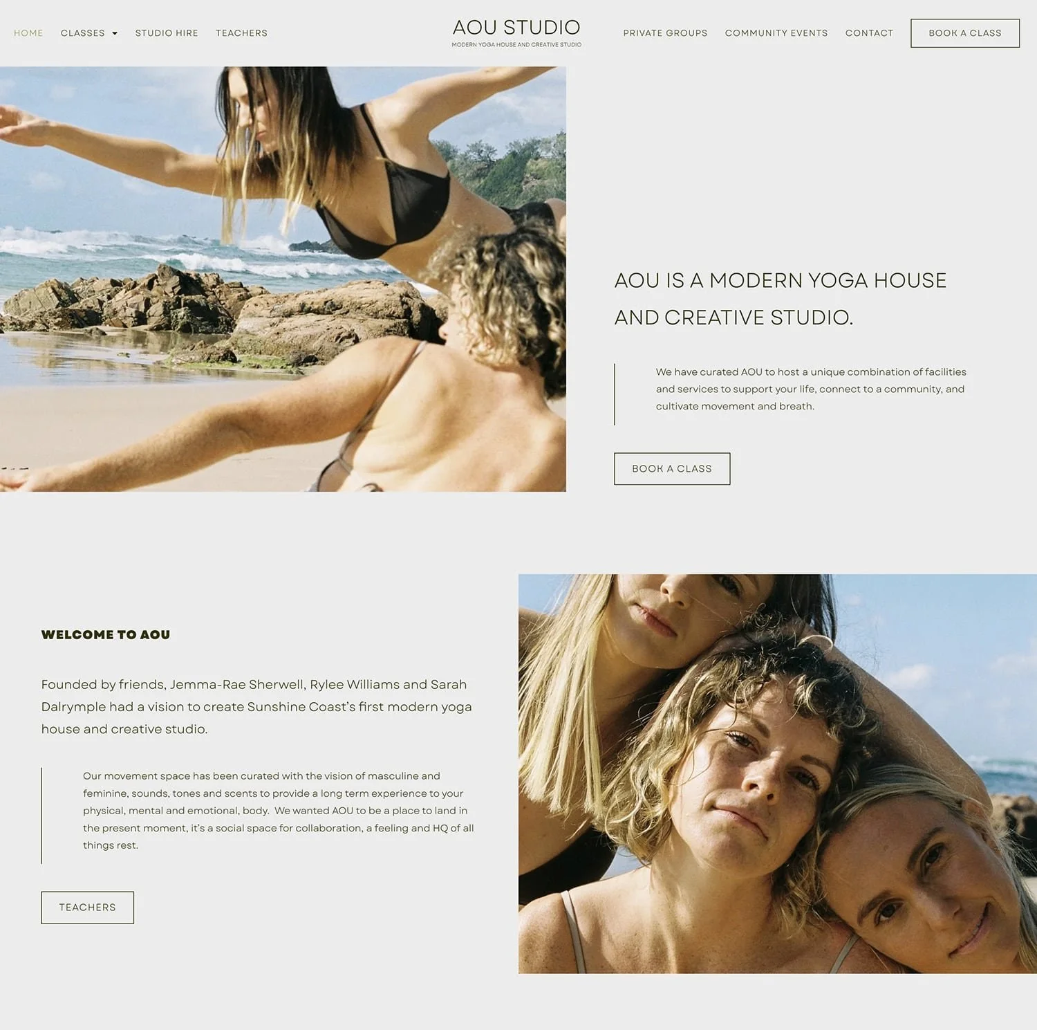
‘AOU Studio’ website remind me of a summer day on the beach. The natural tones and the sun soaked photos bring a grounded and calming mood.
Things I loved ❤️:
The candid photography style and film grain effect.
The lightness and airy feel.
The neutral color palette.
09 // Glow Flow Yoga by Nina Park
Made with: Webflow
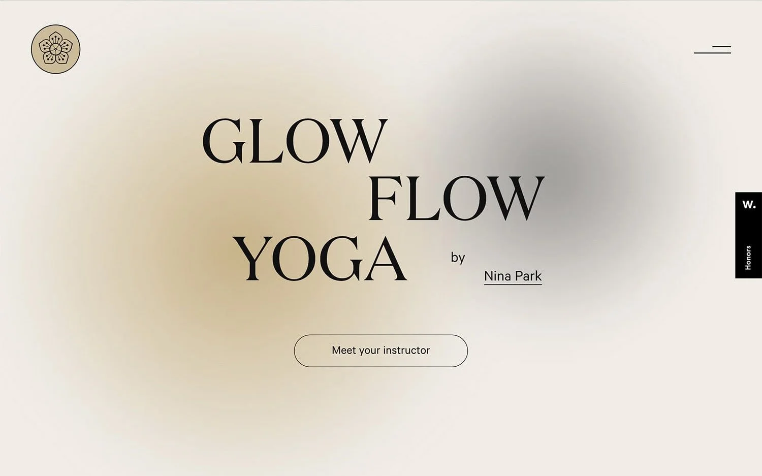
What happens when a a former Taekwondo champion and K-Pop music artist decides to become a yoga teacher? ‘Glow Flow by Nina Park’ is born.
Things I loved ❤️:
The subtle gradient backgrounds and minimal aesthetics.
The animations of text blocks.
The switch between light and dark mode as you scroll down the pages.
10 // Hale.Now
Made with: Webflow
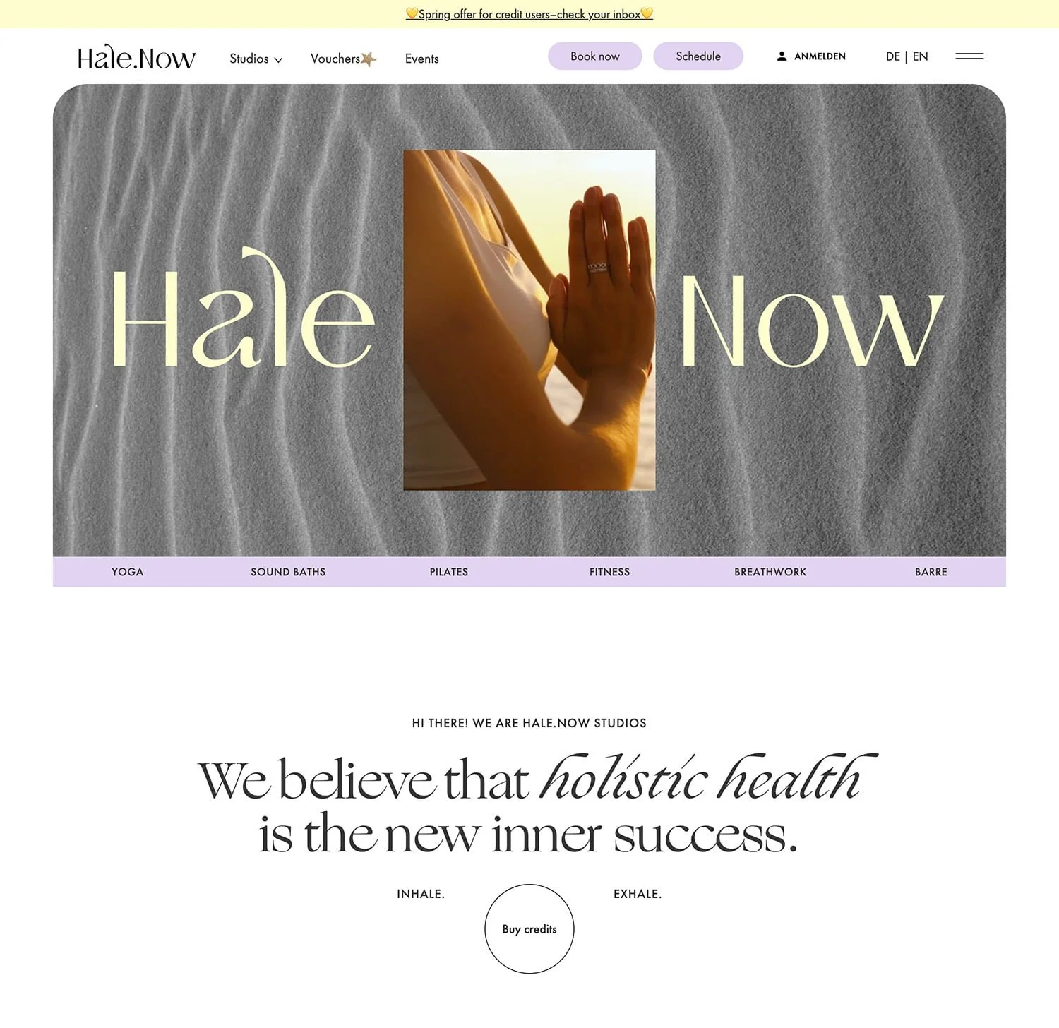
‘Hale.Now’ website is the digital home of five studios with different locations plus they’re offering online classes, workshops, retreats and special community events. Quite a few things happening under the same roof which makes it such an interesting case study.
Things I loved ❤️:
The cream lemon and pale purple color combo.
The headline font because of its distinct calligraphic traits and artistic feel. If you’re curious, it’s called ‘Ogg’ by Sharp Type.
The circle buttons.
11 // Three Jewels NYC
Made with: Squarespace
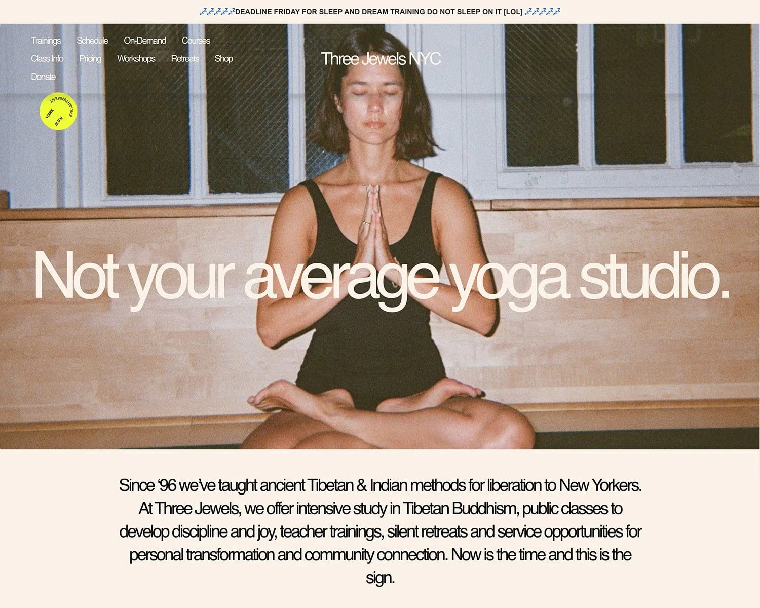
‘Not your average yoga studio’. That’s what ‘Three Jewels’ promise on their website. As well as ancient Tibetan and Indian teachings with a fresh, welcoming vibe.
Things I loved ❤️:
The 90s retro photography style. Subtle nod to ‘Three Jewels’ history and how they started as a nonprofit in 1996.
The ‘New York Enlightenment’ smiley image that goes around the whole screen.
The community photos.
12 // Balance
Made with: Wordpress

Unlike many yoga websites that follow the light and airy aesthetics, ‘Balance’ site is quite the opposite - imagine dark mode with lots of black backgrounds.
Things I loved ❤️:
The way that photos stand out on the black background.
The simple legible font choice - feels minimal and contemporary.
The well organized navigation. Lots of things hidden in dropdowns and yet easy to find what you’re looking for.
13 // The Sacred Space
Made with: Shopify
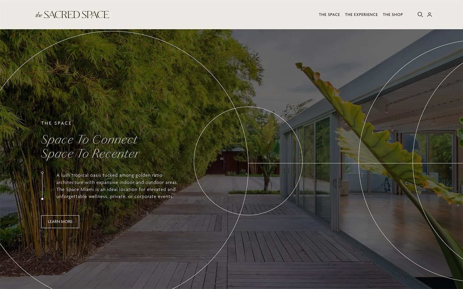
‘The Sacred Space’ is more of a wellness destination. Yoga practices are just one of the things they do but it’s worth looking at their website. It feels high-end and zen, sophisticated and spacious.
Things I loved ❤️:
The geometry elements referring to the golden ratio architecture and landscapes of the venue.
The grainy gradient backgrounds.
The textures and torn paper graphics.
14 // Yogamaya NYC
Made with: Wordpress
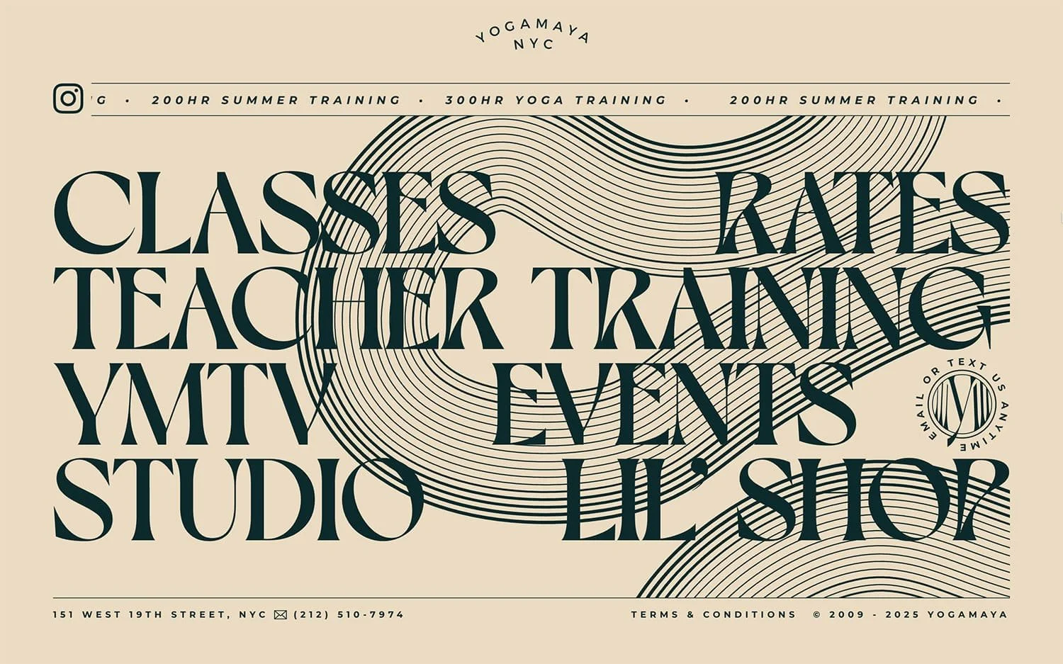
The homepage of ‘Yogamaya NYC’ fits in just one screen, no scrolling down and yet it feels so rich and abundant. Each time you hover over the headlines a new gorgeous illustration pops out. Interesting experience.
Things I loved ❤️:
The custom illustrations and vintage aesthetics.
The extravagant yet delicate headline font. If you’re into type, definitely check Dahlia typeface by VJ Type.
The animations. Slide your mouse cursor over ‘Events’.
15 // HERSPACE
Made with: Wordpress
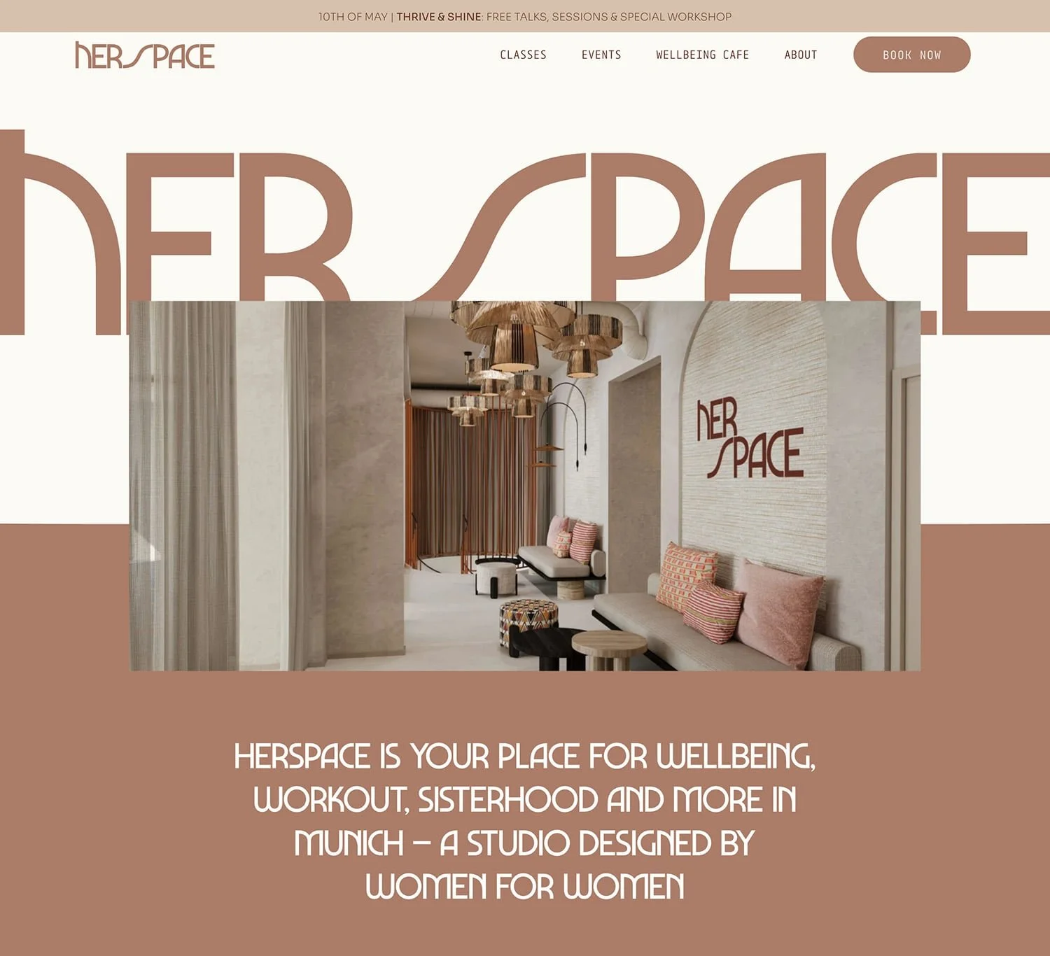
‘HERSPACE’ is a studio designed by women for women. Feminine aesthetics plus some seriously supportive sisterhood vibe.
Things I loved ❤️:
The warm earthy reddish-brown color used for headlines and backgrounds. It has the ability to create a cozy and comforting feeling.
The supportive and empowering tone of voice.
The headline font because of its bold geometry and distinct personality.
The graphic with the four phases of the cycle. There’s a more compact version on the homepage and a more detailed one on the classes page.
16 // Ourano Yoga
Made with: Wordpress
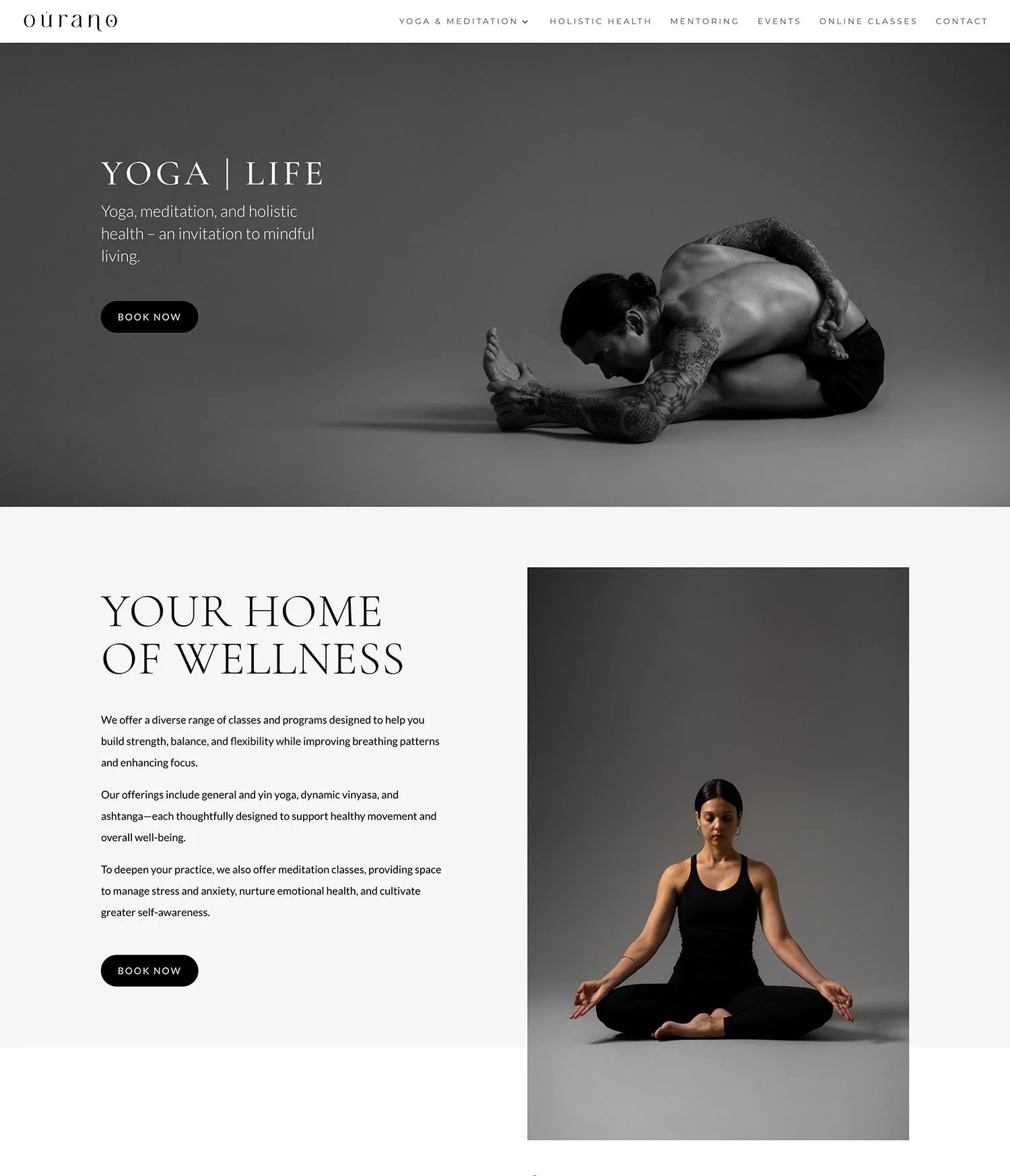
‘Ourano Yoga’ website feels very clean and simple - neutral backgrounds, mostly in white and light grey. Even the photos are stripped from color. If you’re a fan of minimal aesthetics, check out the site.
Things I loved ❤️:
The peaceful minimal style.
The artistic photography.
The custom type driven logo.
17 // Casa del Moviment
Made with: Wordpress
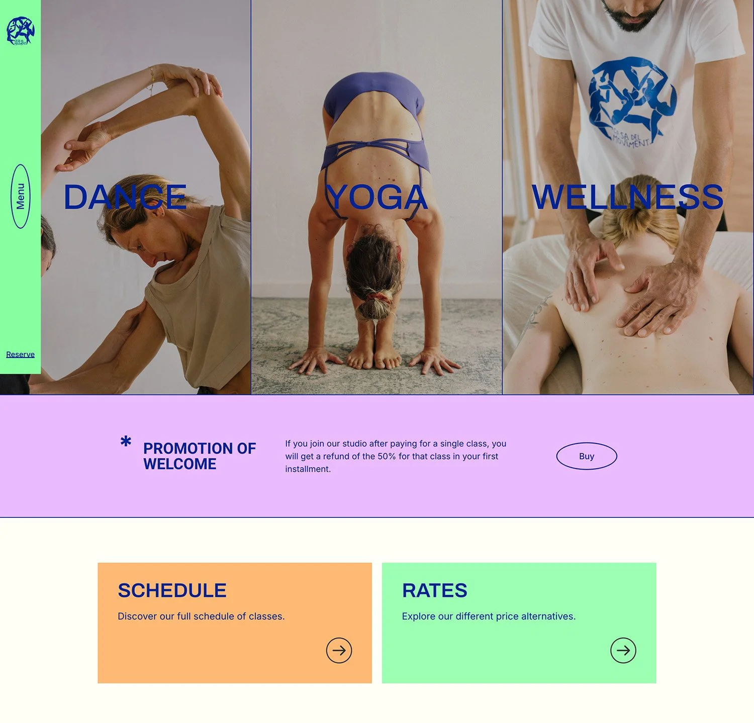
A vibrant case study from Barcelona. ‘Casa del Moviment’ is a dynamic dance, yoga, and wellness studio and so is their color palette.
Things I loved ❤️:
The vibrant color palette.
The presentation of the different disciplines on the homepage. It’s super clear what they do and it’s presented in an impactful way.
The unexpected layout of the menu that pops out from the left of the screen.
18 // Open Studios
Made with: Wordpress
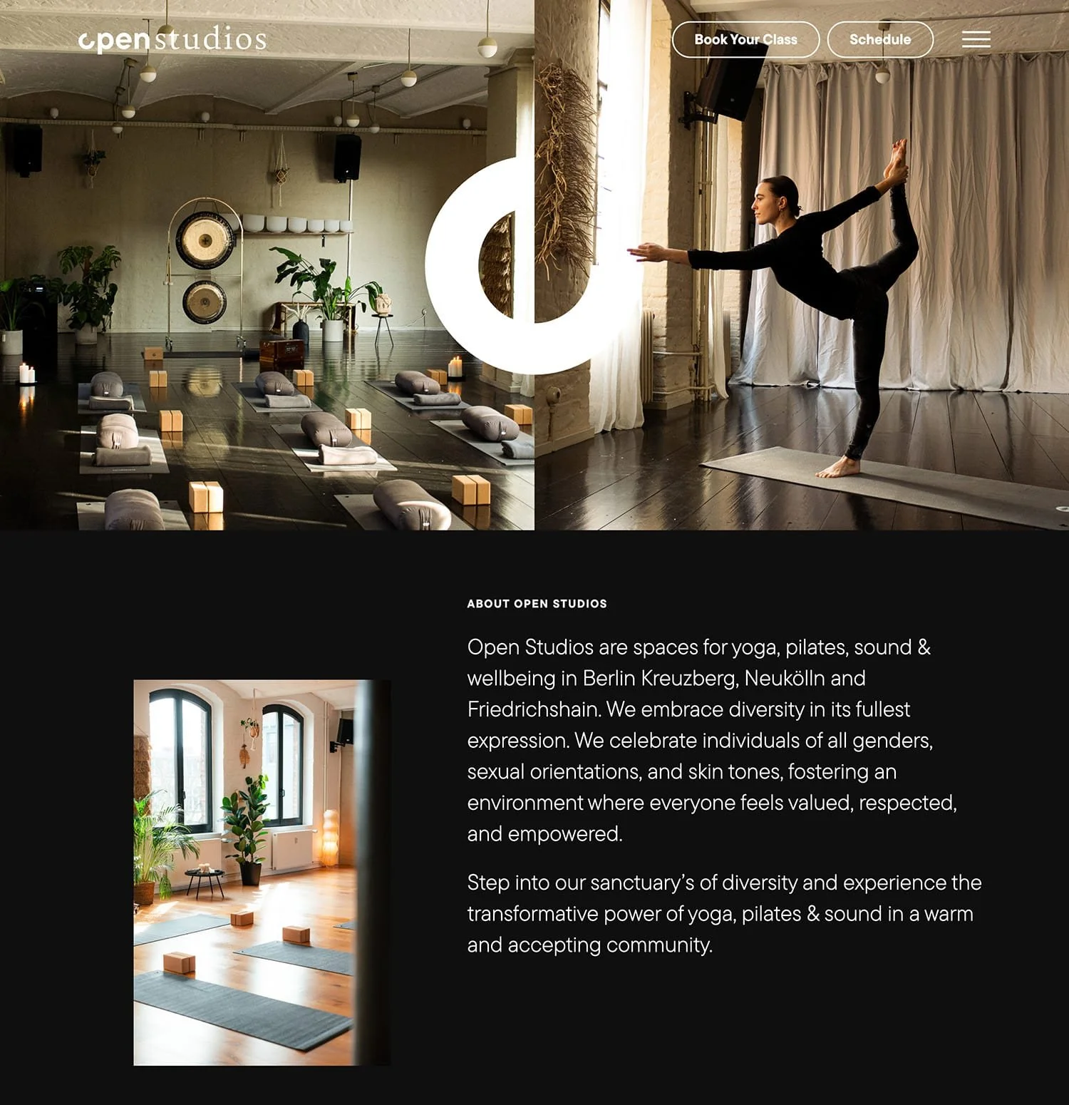
Another modern looking website, this time for ‘Open Studios’. Neutral color palette, lots of black backgrounds for high-end feel and bold headline font.
Things I loved ❤️:
The open letter ‘o’ in the logo. Creatively used as a stand alone element throughout the site and it’s like a fun wordplay with the brand name.
The Spotify player integrated on the homepage. Nice way to introduce a new sensory element and dive in the studio’s atmosphere.
The videos on diffrerent pages that give us a glimpse of what the studio looks like.
19 // Highland Yoga
Made with: Wix
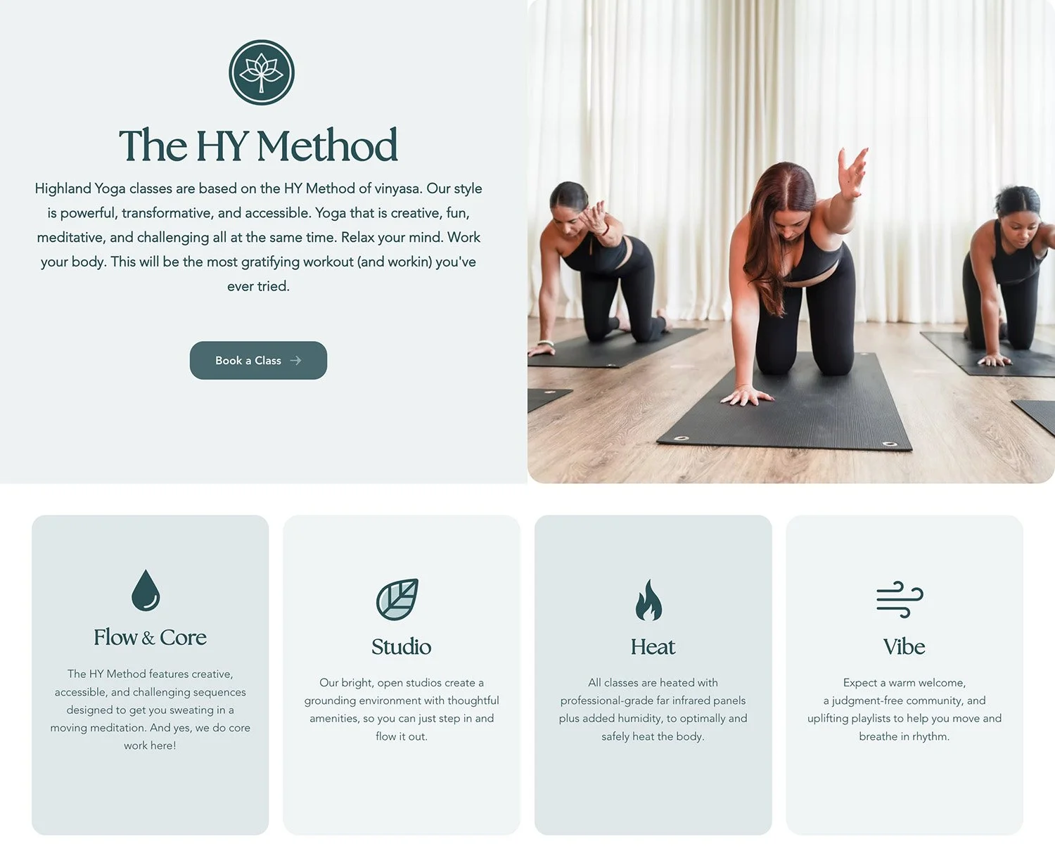
‘Highland Yoga’ website feels calm and balanced but there’s also this uplifting lets-help-you-move vibe. Or as they say “Relax your mind. Work your body”.
Things I loved ❤️:
The different shades of teal in the color palette that bring a sense of calm.
The video on the homepage.
The CTA button on the hero section. That pink color definitely stands out.
20 // Practice Feel Glow
Made with: Squarespace
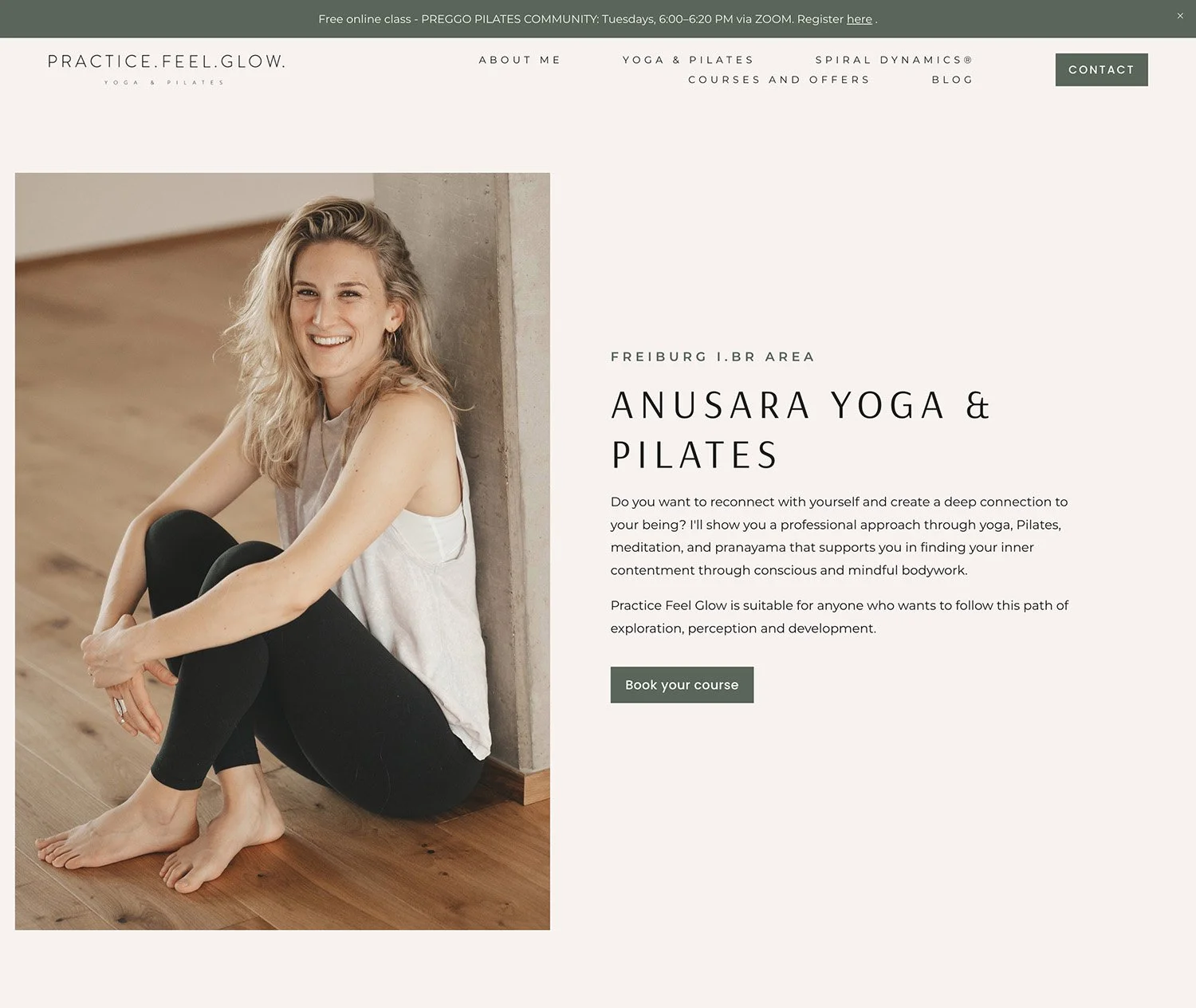
‘Practice. Feel. Glow’ website is the digital home of Catrin, yoga teacher with passion for Anusara yoga. That’s right. Solo yogipreneurs can have their own website, too.
Things I loved ❤️:
The calming shade of green in the color palette.
The minimal watercolor illustration elements spread out through the pages.
The professionally taken photos.
21 // Mindful Flow with Angie
Made with: Squarespace
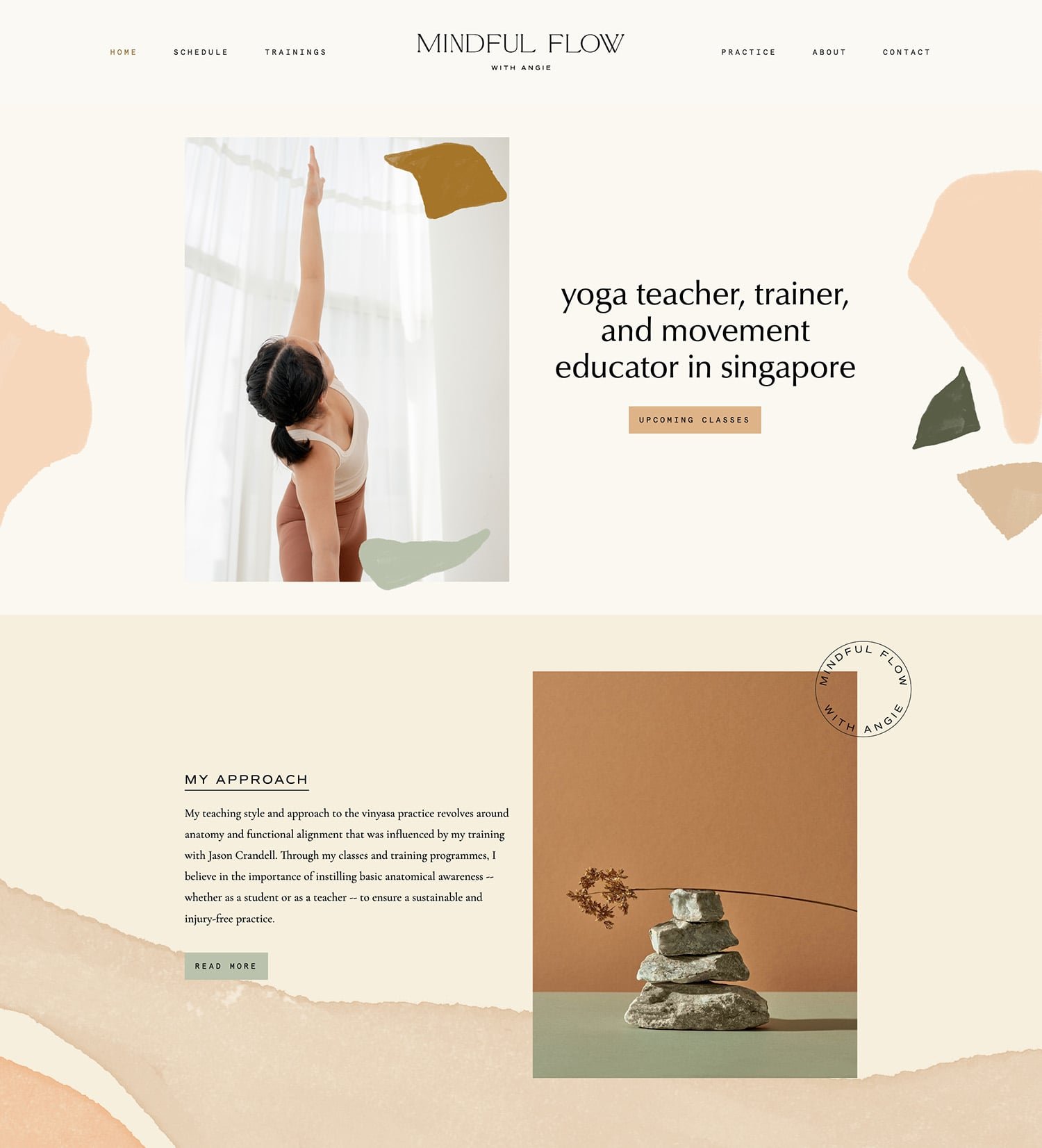
This is one of my favourite projects because of its artistic flair. Look at those gorgeous textures and splashes! 😍
Things I loved ❤️:
The watercolor elements and artistic touch.
The playful color palette.
The line art drawings.
You’ve got the inspiration. Now what?
If you need help with the design, definitely check out my Squarespace website design service. Let’s bring your vision to life and start building your dream website. ✨
Pssst! I made you something 🎁
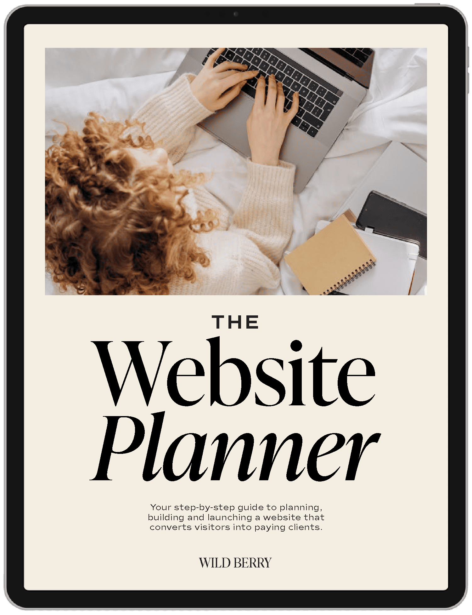
If you’re planning to launch your first website (or redo your existing one), and want to do it right, definitely check my FREE Website Planner.
It walks you through the exact steps to creating a website that not only looks beautiful but actually helps you get more clients. 🚀✨